Shazam App Redesign by Christopher Szabat

I present to you my concept of redesigning the Shazam mobile application. Another my daily that took me 3 hours. I am very happy with the effect! 😊✨💪
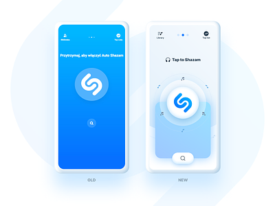
1. This concept solves the problem of too much saturation. After checking the original colors of the application with the "Contrast Checker" plugin, it turned out that they do not meet WCAG standards. So I decided to do something about it and fix it.
2. Navigation in the form of 3 dots has been made more accessible and visible.
3. It is easier for the user to use the thumb to click the "Shazam" button and in the search bar because it is in the "green thumb zone" and requires less reach of the thumb.
4. The notes around the button can be animated, making it even more enjoyable to use the application, and the user will be more likely to come back to it. This allows more dopamine to be released in the brain.
I love what I do and day by day I am becoming a better designer and person. All this develops me a lot, I am grateful ❤️🙏🌌☯️ Thanks for support and watching! 👍