音樂應用程式


Music App. Yes, this is it, a new design. I’ve been so busy the past few months and now finally got some time to make a new design.
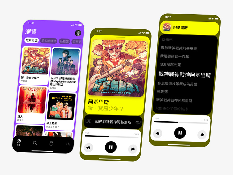
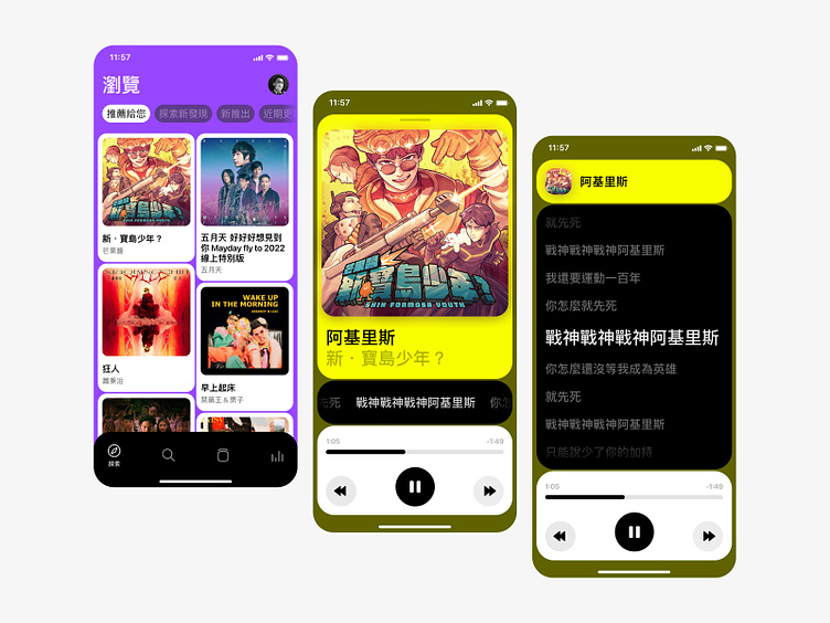
Since I’ve always done a realistic approach for my past design, max the usability and accessibility, making them light or dark background with simple colour, for ages. I’m aware that my design lack colours and getting afraid of people thinking that ‘Damn is he bad at colouring or what?’, so here is it- a bold colour usage, gonna blow your eyes.
This is my first time trying the new design trend that pops up from nowhere recently- main text weight between Regular to Medium, with narrow white space… Whether this trend would become mainstream still remain unknown, But surely visual is deeply impressive.
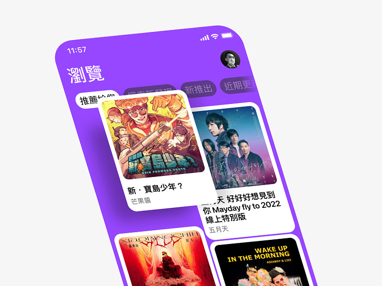
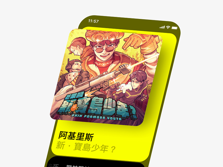
Also, the Shin Formosa Youth album that I refer to is truly amazing. from one of my favorite band @mangojumptheband, Go check it out, everyone.
Anyway, Hope you folks like it then!
音樂應用程式。好的,沒有看錯,我真的發新作品了。過去幾個月忙死囉,現在終於有閒可以做點東西。
因為我過去的作品都是實際取向,清一色套上了近幾年流行的去差異化,也就是作品大多都是以黑白兩色為基底的意思。我也有覺得自己顏色太少,也有點怕有人覺得說「幹,他是不是不太會配色所以才是黑白的」,這一次就給它搞出了大紫大黃,直接炫爆各位眼睛。
這次嘗試了最近幾個月開始跑出來的風格,以 Regular 到 Medium 左右的字重作為主要文字,搭配小尺寸的間距⋯⋯這種風格未來是否會在業界實際應用仍是未知數,但是不得不說,它強烈的風格真的令人印象深刻。製作這件作品也是一件有趣的嘗試。
然後《新・寶島少年?》真的很棒,來自我的愛團 @mangojumptheband,請各位也去聽。
以上,希望各位會喜歡。
本作品使用 🅵 Figma 創作。這是我第一次全程用 Figma 做設計,還真的很新鮮……
——
素材版權屬原版權者所有。在 Instagram 追蹤我