Brooklyn Follies

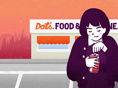
I was taking some lettering classes at Skillshare and the class project was making a drop cap letterform for a book cover. I chose "Brooklyn Follies" from Paul Auster and my idea was drawing an "A" from a girl opening a Coca Cola can. I stick to that idea and failed big time so I have to find another idea and do it again. http://skl.sh/1vKCUAz
But the drawing itself was not bad so I used it to try some tricks a friend found for me on the Internet. I wanted the sign of the restaurant to look like those signs from before there were computers everywhere and those designers weren't aware of what we now call lettering. https://dl.dropboxusercontent.com/u/3570799/brooklyn_Follies_dots.jpg