Lifeline Case Study

Lifeline is a mobile app that makes managing your health easier.
Challenge
Design a healthcare app that will help users manage their health, prescriptions, find care, and improve communication between providers and patients resulting in quality care, patient satisfaction, and operational efficiency.
Market Research & Competitive Analysis
First I compared some existing services already on the market, I identified pain points and areas that needed improvement. I completed a competitive analysis and created a questionnaire with Google Forms to discover what was important to the user. My initial findings provided me with an insight into what areas I needed to focus on while giving me an understanding of who my user is.
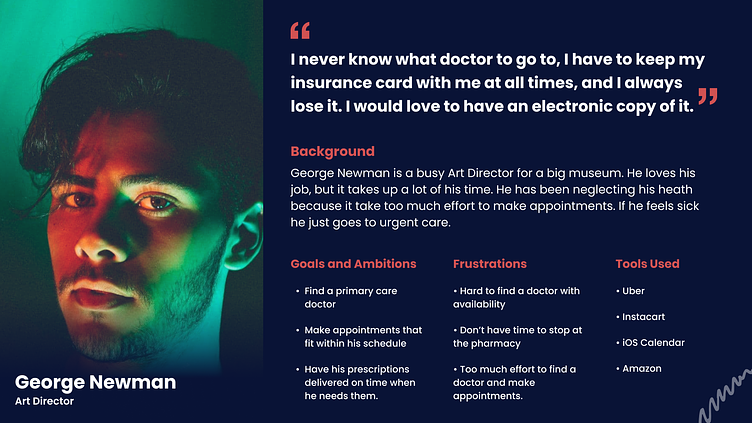
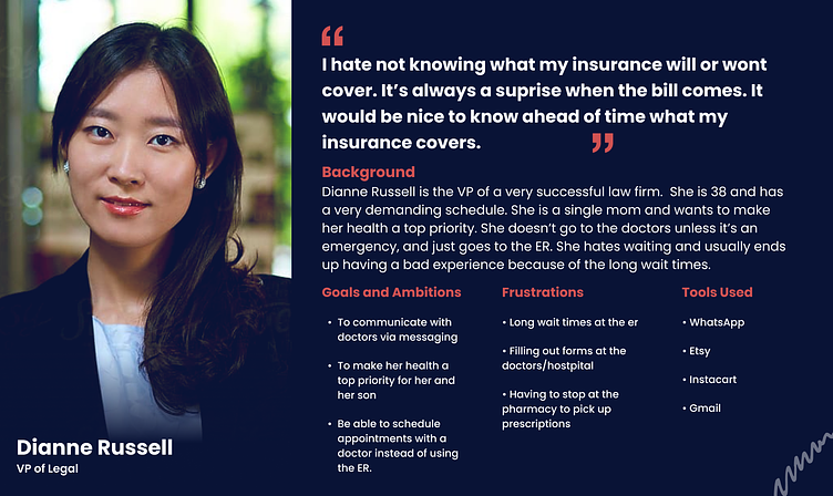
User Personas
Based on my research I was able to create two user personas. I used my initial findings from my research as well as the information collected from my online survey.
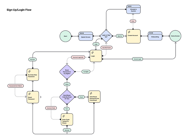
User Flow
Next, I designed user flows for my app, Lifeline. I created a user flow for each section to ensure I focused on areas of importance. I wanted to have each area be well defined, and feel connected to every part of the app. Simplicity in the flows and the user were the main focus.
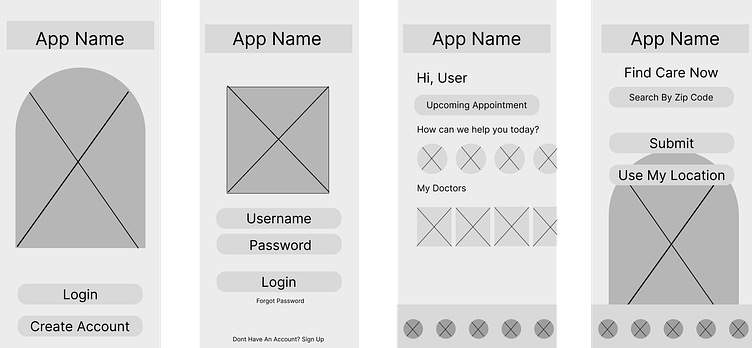
Wireframes
After completing the user flows, I developed some wireframes. I started with basic sketches, and turned those into lo-fi wireframes. I focused on simplicity as well as keeping the goals at the forefront.

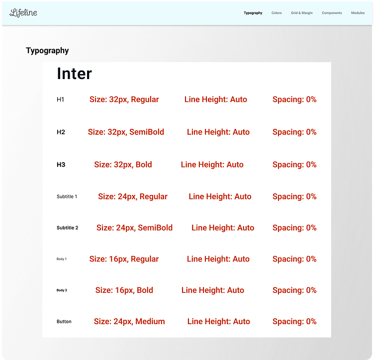
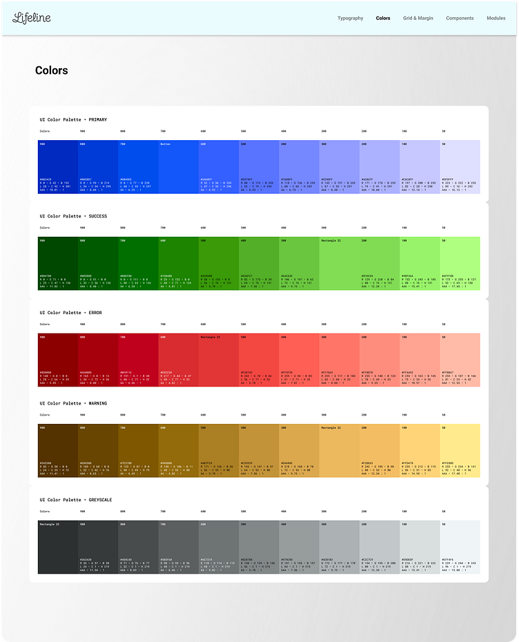
Visual Design
I showed my initial wireframes to colleagues and received some critique reviews. I improved on my designs and got to work on the visual design. I started with a moodboard and decided on the direction that was more accessible, and began designing high-fidelity screens while extending the visual branding across all screens. I defined color, typography, and created a UI library to keep my design consistent.
Features and Benefits
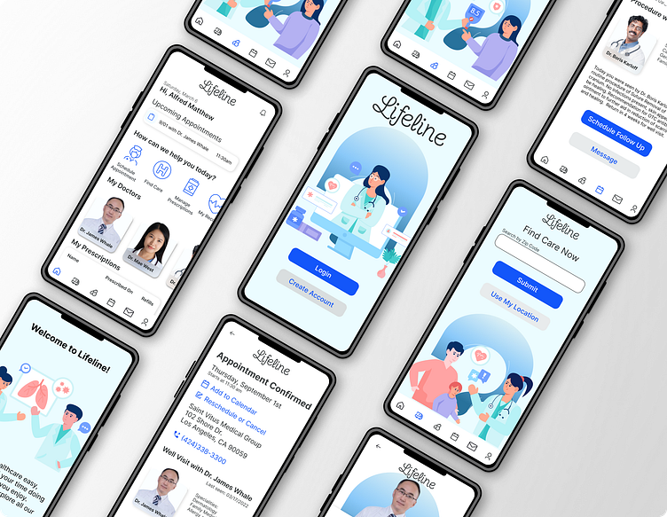
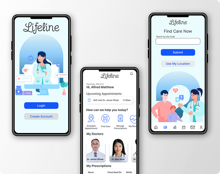
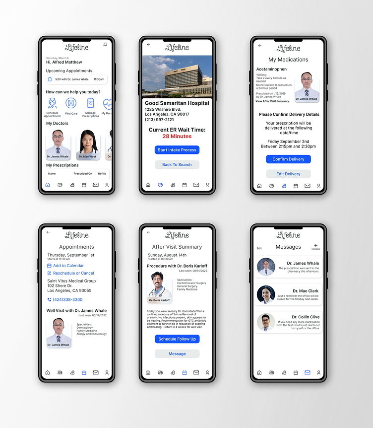
Throughout the design process I kept in mind the initial goals of the app, to help users manage their healthcare. The features I added to the design were finding care (urgent care or emergency room) by entering your location and seeing a map of the closest facilities. When looking at the options you have the ability to see wait times, and once decided on, you can start the intake process and are given a QR code to scan upon arrival. The prescriptions section of the app allows you to view current medications, as well as who prescribed them, and the option to refill via delivery or pickup at your preferred pharmacy. The message portion of the app connects you to your physicians and allows you to communicate directly with them. Last, the appointment screen allows you to view past and upcoming appointments, also the ability to schedule new appointments with your doctors. The my profile section lets you store your insurance information, and provides you with a digital card, in case you lose your physical copy. You can also store information like allergies, save intake forms, and enter your primary care physician and preferred pharmacy.
Prototype
I created a prototype for Lifeline in Figma, and developed a usability testing plan. After conducting in-person testing, I gathered feedback and iterated on how to improve accessibility and any design critique. The prototype can be viewed and tested here. S is the action key for all text boxes.

Feedback from testing provided valuable insight for iterations.
"The onboarding screens should have better hierarchy. The text gets lost and I find myself skipping to the next page without reading"
"The cards need to have more definition, they get lost and the top blends into the background making it hard to decipher where the card ends and the background starts"
"The forms should be split into pages, rather than one long one. Maybe adding a progress bar with and pages will make it easier?"
Refine & Measure
After testing the initial prototype and receiving feedback, I refined my design and sent the new prototype back to users to be retested and measured success.
"I would love to use this app, I wish I could switch my current one for this. Its so much easier to use and navigate and would help me manage my health a lot better"
"I like how easy the interface is, it makes me want to be more proactive about my health and it feels like I would have everything I need right at my fingertips"
Users felt the experience was simple, effective and modern. They had no trouble completing the tasks and were inclined to be very eager to use and explore the app. Users tested saw a great value in the app, and wanted to use it to manage their own health.
Final Thoughts
Designing this was equally challenging and rewarding. It took a lot of work and iterations to get to the final screens I ended up at. The critiques and feedback were of equal value as the initial research and discoveries I made at the beginning of this design. My end goal was to reach a solution to the initial challenge while sharing my journey along the way. You can view the Figma file in its entirety here, which shows a more in depth look at all the stages of this project.