Caribe Paint.

Brand Identity, Brand Architecture, Signage & Environmental Graphics, Packaging, Digital Strategy
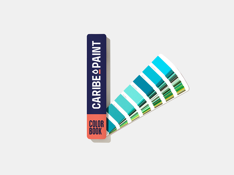
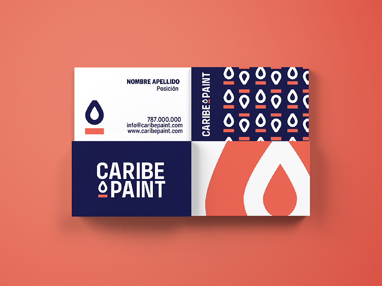
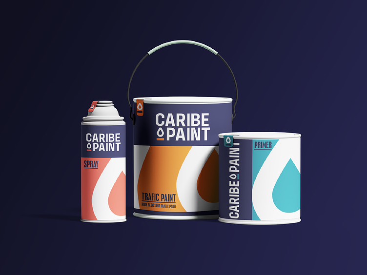
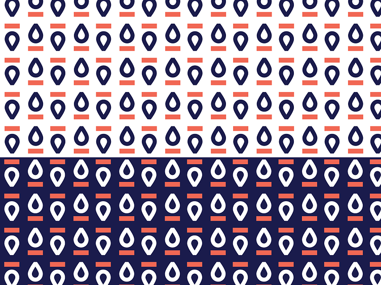
We designed a minimal logo with a drop of paint and a rectangle representing a roller mark. A sans serif typeface keeps it clean and straightforward, and to embody the Caribbean, we applied a coral color. We also launched a digital campaign called ¨Todo pinta bien¨, to create brand awareness and grow their community.