Bullseye branding guideline


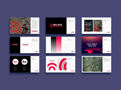
Gis mapping company brand identity.
We offered the client a new approach to his brand, focusing on the accuracy and manufacturability of the GIS system. We have selected the most accurate color scheme reflecting the bull's head and the clarity of his vision, fully reflecting the character of the Bullseyes Mapping brand, and logo means an accurate hit on the target
Follow us for daily feed of inspiration and press the 💙 button.
Feel free to Keep in touch 🍪🍪🍪
_____________________________________________________________________
📬 Let's work together: hello@klevercookie.com
🌐 Website: klevercookie.com
🍪 © KleverCookie