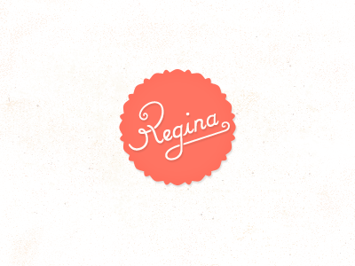
Shot Regina Wip - progress
Second option. MUCH adjustment made to the lettering, and dropped the "g"'s underline to add more space. To get a feel of the site this will be on visit this shot.
View all tags
Posted on
Jun 15, 2011
More by Christo Steyn View profile
Like


