


James Davidson Footer

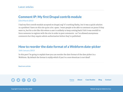
The main focus of James's website is the typography. As he's a developer rather than designer, the focus needs to be on the content, what he achieved per project, his roles etc rather than the visuals of the website.
I settled on a pairing between Lato and Merriweather Serif for the content and Playfair Display for the headings. I was inspired by Medium's one column style as the website isn't going to have a lot of content to spread over multi columns.
I used various shades of blue to lift the content as that's James's favourite colour.