


Dog Walking App - Case Study

Hi my name is Yousef, and I’m a product designer. This case study is part of Dribbble’s Product Design Course. They gave me an idea to work on, which is “Dog Walking App”. And in this project, I did the research, user flow, wireframing, design and prototype.
Market Research + User Research
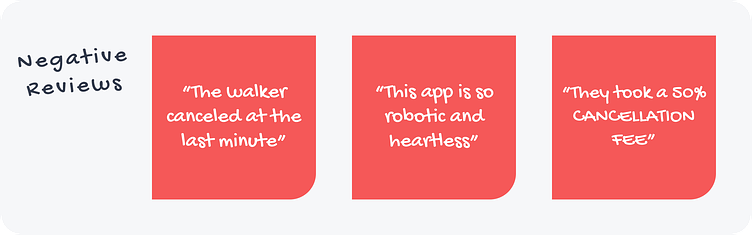
Let’s talk first about understanding the user. I did a small market research on Walking Dog apps. And the most famous apps on the US market are Wag! and Rover. I liked Wag! app more and my challenge was to make a better version of it 🤞. To understand the target user, I read Wag! reviews on https://www.trustpilot.com/review/wagwalking.com
And below are the most repeated reviews:

Now, in general, The target users are dogs’ parents who can’t walk their dogs, for some reason. Yet, They have to walk their dogs everyday to keep them healthy. Of course, the best solution is asking a friend or family member to walk the dogs. But they can’t do that every single time, so they need a walker. And that’s the main pain point.
Persona
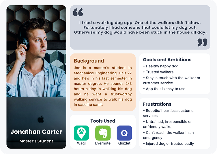
Based on user goals and frustrations, these are the app requirements:
Clear measurement of the walker's performance.
Provide more than one way to be updated on the dog situation.
Provide clear home screen to find the right service.
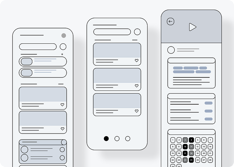
User Flow + Wireframes
Here I started to plan, to answer questions like What is the user’s goal? What are the steps the user needs to take to achieve that goal? And based on the answers, I created the following user flow:
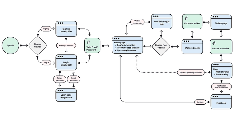
I needed to make a skeletal structure for each screen within user flow. Also tried to figure out how can the content be organized in each screen. With the user’s goal in mind of course.
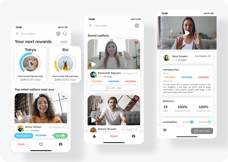
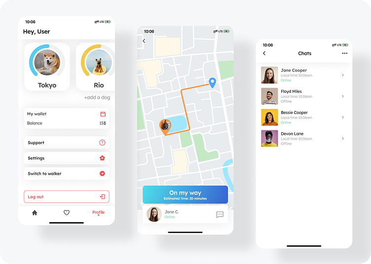
Visual Designs
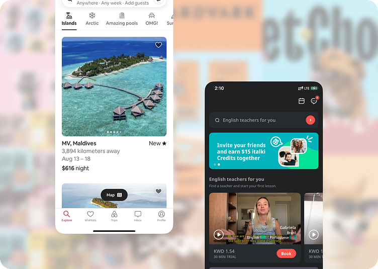
Before designing, I started to collect photos/ screenshots for inspirations. I wanted my design to be a minimal and clean. And Airbnb and italki were great inspirations.
I started with changing the wireframe screens. And I focused on the Alignment, Hierarchy, Color and Typography.

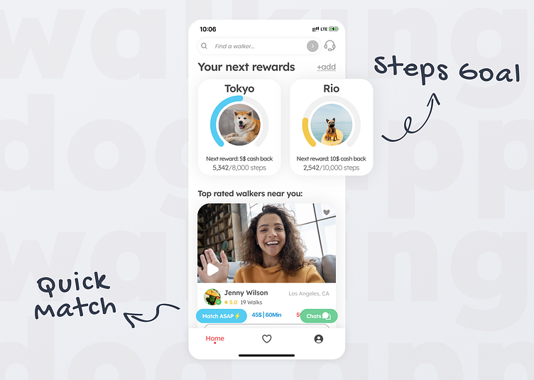
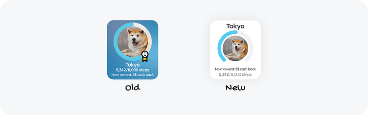
Prototype + Test
After I made the first prototype, I tested it with two of my friends and both of them missed the “steps tracker” card. They thought somehow it is an advertisement or membership packages at first sight. So I decided to change the the card’s hierarchy and colors to make it more clear.
I learned a lot from this case study. I learned the tools, like research, planning , choosing the right font and colors, and more. I learned also what is designing. Which is the process of creating product with great user experience.