Archon

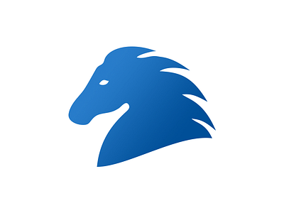
I created this logo for Archon, a friend's European-Mongolian joint venture trading company. After some research, I made a logo with several layers of meaning which should create the visual cultural bridge.
I tied the archetype of lordship in the company's name to Bai-Ülgen, the creator deity of the Mongols. It was believed he created the earth, the sky, and all living creatures and symbolizes good, wealth, and abundance. A frequent motiff in the rituals of Bai-Ülgen's worship were symbolical "sky journeys" of his shamans. Hence, the horse's blue head - which also happens to be the dominant color in the flag of Europe.
The horse itself was considered not just the most important animal to the Mongols, but was also sacred to Bai-Ülgen. Ritual sacrifices of horses were a recurring motiff in the deity's rituals. Even today, some Mongol steppe nomads still cut off horses' heads to bring upon themselves the blessing of heaven and good luck. That's why the logo shows just the head of the horse and not the full figure - in a way, it's a cultural code for good luck. At the same time, any European seeing the logo would simply see a horse as a symbol of strength, movement, and freedom - all great associations for a trading company - and not a severed horse's head (which would undoubtedly be considered a distasteful symbol).
Finally, the horse faces left for a few reasons. The company is based in Ulaanbaatar, but it looks to the west in its business activities, exporting goods to Europe. The direction is also reminiscent of old Mongolian banners which always displayed horses facing what the European heraldic tradition would consider the dexter side - the side of greater honor.