


Pikes Peak State College Rebrand


That Time I Rebranded a College
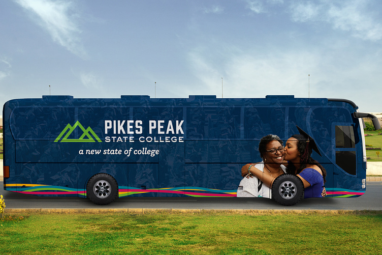
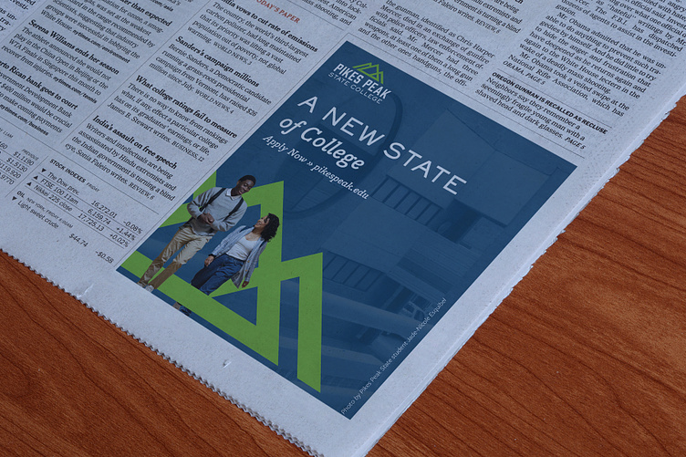
A New State of College
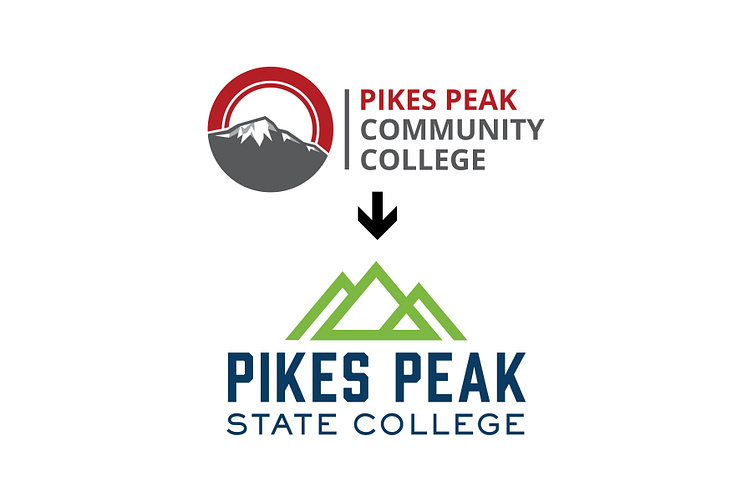
Pikes Peak Community College is the second largest community college in Colorado. In Spring 2022, Governor Polis signed legislation to change the name to Pikes Peak State College for two reasons: remove the stigma of community college when students enter the workforce and to reflect the expansion to offer more four-year degrees.
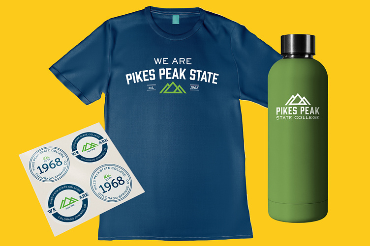
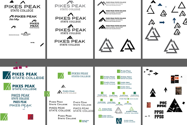
The new identity needed to keep the mountains that had been part of the original logo since the college's start in 1968, but it was important to have it mean something beyond a geographical location.
During the exploration phase, I found that the core values of Pikes Peak are: education, exploration, and mentorship. I represented those values by creating a 3-peaked mountain. I kept the shapes geometric both for usability across a variety of mediums, but also to represent arrows pointing upward to our students' futures.
Role
+ Brand Exploration Research
+ Client Presentation
+ Concept Development
+ Art Direction
+ Logo Design
+ Brand System Design & Implementation
Find Your Path
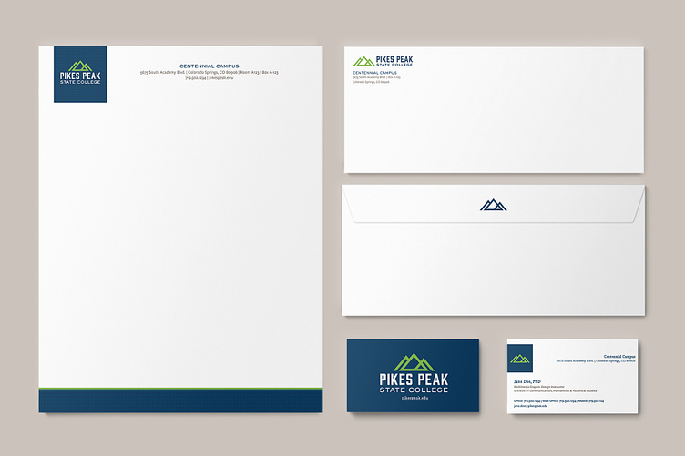
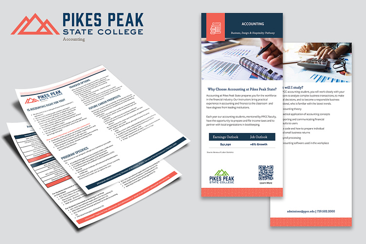
After the logo design and color palette were approved, I had to start building out the system. The college has over 200 programs and dozens of student services.
The academic programs are broken out into 6 pathways that students can peruse to see what piques their interest. The pathways launched in Spring 2022, so the concept is fairly new and unfamiliar.
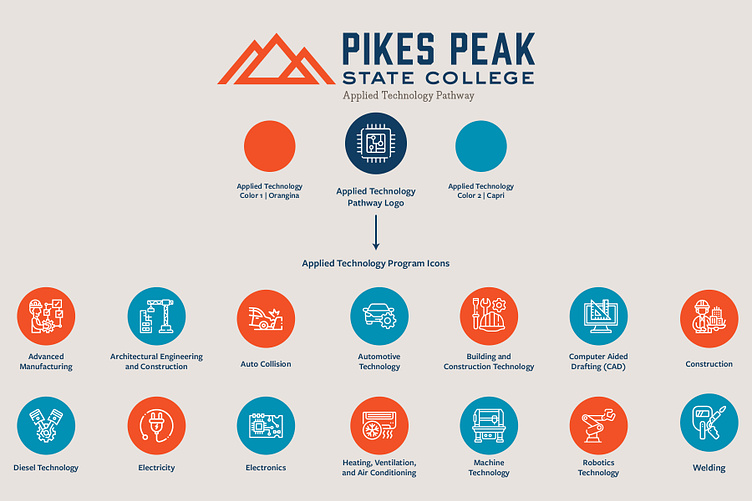
I created a sub-system for the pathways by assigning each one a color code, an over-arching icon for the pathway, and individual icons for each program.
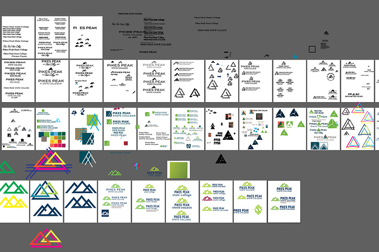
It's Been a Process...
The design process is the best and the worst. You go through all of the emotions from "this is the best design in the world," to "I am the worst, and literally no one should employee me in this field."
It's important to show process. You need to show where your ideas came—that there was a strategy behind them. Where you start is rarely where you end up.
The last few miles of a marathon are the most painful—t's when you truly think you're going to keel over on the side of the road. But, suddenly, you get that adrenaline rush with the determination to finish. The creative process is a lot like that.
I think when it has been especially laborious, the prize of hitting the finish line is all the more sweet.
The official launch for the new brand identity is on the first day of school, August 29. t here...