Redesigning 40 Products into One Holistic Experience


A case study in simplifying and redesigning an unwieldy collection of 40+ digital subscription products.
My Role: Creative Direction, Business, Product & Design Strategy
From: March 2021 - July 2022
In 2001, the Motley Fool got into the subscription business setting up five print newsletters, each covering a discrete focus for investors – large-cap, small-cap, value, growth, and dividend stocks. Each monthly newsletter provided the same straightforward value proposition: two new stock ideas delivered every month. The five subscriptions complimented each other to make a well-rounded portfolio.
As The Motley Fool expanded its service offerings to over 40 products, differentiation diminished. The new model delivered a confusing experience to the high-value high-end members who owned multiple services.
Meanwhile, 20 years of tinkering and accretion of features, tools, and tests was straining the ability to upkeep over 40 services. The sites were beginning to falter, impacting existing retention.
I was fortunate enough to help orchestrate and lead a project that would resolve these concerns and take The Motley Fool from its newsletter past into an application platform future.
The Challenge
The goal of this project was to recapture the elegant simplicity of the early subscription days with a fresh interface and experience that clarified the value propositions and blended to make an enhanced experience.
The high-level goals were:
Challenge the legacy newsletter structure of 40 individual sites and make a centralized holistic experience that reduces frustration and cancellations.
Restructure the product structure to make it simpler for members to know what they own.
Make owning multiple services additive by enhancing the experience with each new service and increasing retention.
My Role
I provided creative direction for the duration of this project, from the onset in March 2021 to the delivery to members in July 2022. I led a team of 10 designers and user researchers through Ideation, Prototypes, Testing, and Deployment.
In collaboration with my peers, the Head of Product and the Head of Engineering, I led the Empathizing research of member needs with the members. I spearheaded defining the problem and jointly pitched the project to senior leadership. Upon approval. I continued to manage up, providing daily updates on progress and sharing prototypes with the SVP of Membership and the CEO
In addition, I routinely engaged and coordinated with peers in Investing, Editorial, Marketing, Customer Service, Legal, and Project Management.
The Process
1. Empathize - Understanding What's Broken
Well before the project began in earnest, I had the UX Research team regularly conduct customer interviews with members to understand their needs and the job they paid The Motley Fool to accomplish.
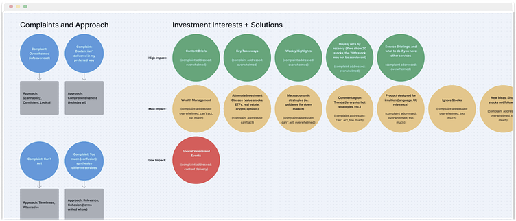
Four primary segments of our member base arose from the surveys and interviews. We codified these variations by creating four primary behavioral archetypes, similar to personas, without getting into the fictitious character creation. My experience leading design and engaging with our leadership team for over a decade gave me the wisdom to know that senior leaders would reject personas. We used small animals as behavioral archetype proxies instead.
We found that across the board, members prioritize finding new stocks to buy and staying advised of the investments they own
The archetypes allowed us to stress test the major problems of the different user bases to ensure we weren't slanting too far to serve any one type, such as the beginner or an expert.
2. Defining - Making the case that we have found the right problem
Each archetype segmentation had variations in our time commitment and experience level. However, overall, the majority of members all came to The Motley Fool with the same Jobs-to-be-Done. We found that across the board, members prioritized finding new stocks to buy and staying advised on the investments they owned.
Problems of our own making added complexity for the member. Through feature accretion and bespoke testing, we challenged the fundamental usability of all our services, especially when attempting to use those services together.
The head of Product and I connected these insights with business metrics – retention rate, upsell rate, and member satisfaction –and delivered the problem statement to our stakeholders, requesting time, resources, and latitude to work on solving these problems.
3. Ideation - a cacophony of potential solutions
I guided our UX Research team on the preferred structure of competitive analysis to investigate how 27 other finance and media companies handled a growing suite of subscription products and how they kept the value clearly defined.
I held brainstorming sessions with leaders of Product, Tech, Editorial, Investing, Business Intelligence, Marketing, Commerce, and Legal. We wanted to hear all perspectives on the best approach to solve members' needs in ways that best serve each arm of the business. The leading ideas called for a site overhaul and an inversion of how we deliver the product suite.
4. Prototyping - Making new solutions feel real
The Head of Product and I reimagined the systems architecture of the collection of 40 products as components of five concurrent levels. Using Loom, Zoom, Google Slides, and Slack, I helped socialize the shift to all departments and collected feedback on the impact on each department.
The leading ideas called for a site overhaul and an inversion of how we deliver the product suite.
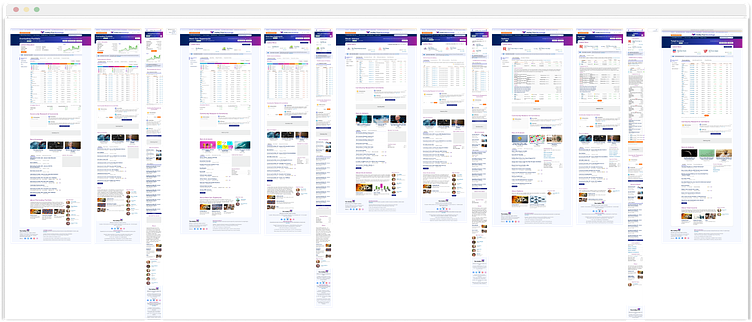
The brainstorming suggested that those five membership levels share one common platform. I collaborated with the lead designer to audit all 40 sites and create a model that could incorporate all the essential elements into one shared site architecture.
I directed my team of designers through the rapid prototyping process. I checked in with my lead designers daily and with each designer on the team at least once weekly. All designers on the project met twice a week for Design Review to share the progress and get feedback from their peers. I signed off on each update before sending it on to be demo'd to leadership.
My co-DRI and I had to update our upline SVPs twice daily and demo to stakeholders, including the CEO, each week. This stage went extensively long as the company directors had much explicit feedback. I directed the Design team through the politics in play and met with them after each demo to review the notes and recording and discuss the next actions.
At one point in the prototyping process, the CEO expressed dissatisfaction with the current design patterns. I had to establish an entirely new design system of more than 100 components for immediate use in this project. The details of that challenge are for another case study.re...
5. Testing - learning about our solutions and our users
Testing occurred through the prototyping process, often shaping the next stage of revisions. Designers tested concept mocks, language, and user flows to validate the product direction.
I led the UX research team in conducting usability testing with members from new to advanced investors to stress-test the architecture of the new membership levels.
With each major update in the prototyping process that impacted the site structure, user flow, or overall design, the updated prototype was QA tested with members to get qualitative feedback that provided immediate updates and backlog items for future revisions.
6. Implementation - bringing ideas to life
For the massive undertaking that was the design process, at the end of the day, design alone will not solve members' problems. The design becomes the solution when it is built and deployed to live.
As work was ready to move to code, I met regularly with the heads of Tech and Product Management and their respective teams to walk through the upcoming work, answer questions and help break it down into iterative steps and stories.
I led my team in packaging up all the Figma files. We organized all the pages in the files to match the new site architecture and included responsive treatments where needed.
At the end of the day, design alone will not solve members' problems. The design becomes the solution once it is built and deployed to live.
When ready to launch, I led the design team in visual testing each page to see that the elements developed matched the designs in Figma. We checked each user flow at each level to see that all the stages were seamless.
The new shared component and pattern library I had begun setting up during prototyping, while initially slowing down the designers, made development move faster, with more predictable results.
Starting from the soft launch, I monitored the incoming feedback channels. I provided direct solutions to users where possible, redirecting to the proper teams (Tech, Editorial) when necessary and incorporating the new ideas into improvements the design team would fold into the successive iterations of the prototypes.
The Solution
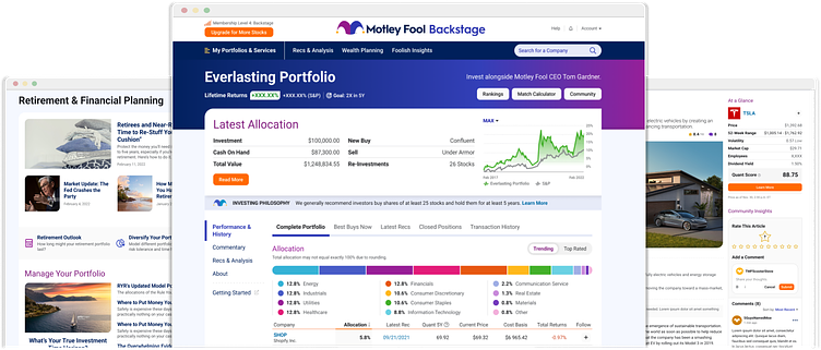
To better serve our members, the 40 subscription products were all folded into one common site experience that broadened with more value as the member rose through the distinct membership levels.
The membership levels were clearly defined and identified for each user to clarify what they owned and where they would go in expanding their subscription.
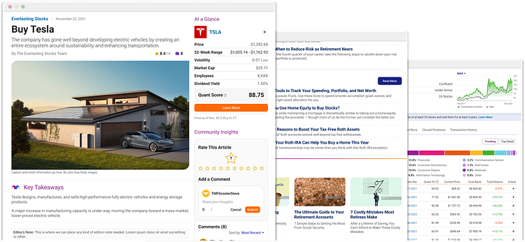
For members with multiple services, they no longer hand to hop from site to site to see the investing ideas. All the buy recommendations, stock advice, and news were all brought together into one common platform, simplifying the experience for the high-value member.
Lessons Learned
Throughout the process, I held biweekly retrospectives with the team to understand pain points and where we could improve the process.
The top takeaway was that our stakeholders did not share the urgency our project managers were impressing. The stakeholders' demo feedback to explore more ideas or build a new design pattern library derailed the timetable for delivery. I met with stakeholders and project managers to address this misalignment and noted how it left designers in an untenable situation.
The most actionable lesson learned was that investing in the right tools and systems can make all the difference. Shifting to Figma just before this project commenced streamlined the ability to quickly turn designs into prototypes and share those assets. The design process had less friction and allowed the team to achieve more.
Lastly, the positive takeaway is that we can indeed do big things. A company, the size of a cruise ship, will lament it is not as agile as a speedboat, but it can still pivot. The Head of Product never gave into the doubt that this was too big to accomplish and advocated accordingly, inspiring others and eventually making the change we believed was possible.
Next Steps
Bringing all the stock recommendations together into one place was a significant step forward for the high-value members, now considered on the highest level of membership. However, more work is still ahead to assemble those ideas into a portfolio.
We have portfolio framework concepts to integrate into the system. Leveraging the research of the different user segments, we have a wealth of knowledge on how best to help our members build their portfolios no matter their level of investing.
The Impact
This solution concluded nearly 20 years of a legacy approach to product development (built on the outdated newsletter model). Not only did this simplify the member experience, but it also significantly reduced operational overhead for PMs, Tech, Editorial, and Customer Service, previously juggling resources to account for all 40 bespoke products.
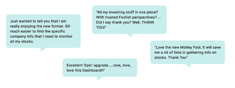
Early quantitative results show member satisfaction leaping by 34%.
Qualitative feedback includes grateful members who finally understand their product and its value.
The Motley Fool begins its next chapter with a modern web-based financial application platform organized for ease of use and increasing member success and retention.
Thank you for reading. Please get in touch for more details.
Note: I have omitted and obfuscated confidential details and information in this case study. All analysis provided in this case study are my own.