Personal Logo

Hi guys! My first Dribbble shot! Thanks to Colm O'Connor for the invite. I've been working on a new personal logo and the goal was to create something really simple and quite minimal using my initials.
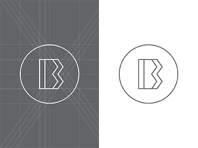
It's pretty straightforward. I simplified the letter 'b' into a geometric shape, removing any curved lines, duplicated it and overlapped the two.
It can be viewed as single letter but on closer inspection we can see the logo is made of two overlapping letters. A modern monograph of sorts.
It would be great to get some feedback, guys!
Cheers!