App It - Brand Development (Concept)

Hi people, happy to share the new visual identity I developed for App It, company wich offer wide range of software solutions from classic desktop applications, web sites, web shops, web applications to smartphone apps.
After doing the research and finding out the key words about the company App It, and the culture of the company, one of the offered words gave me a guideline for brand development.
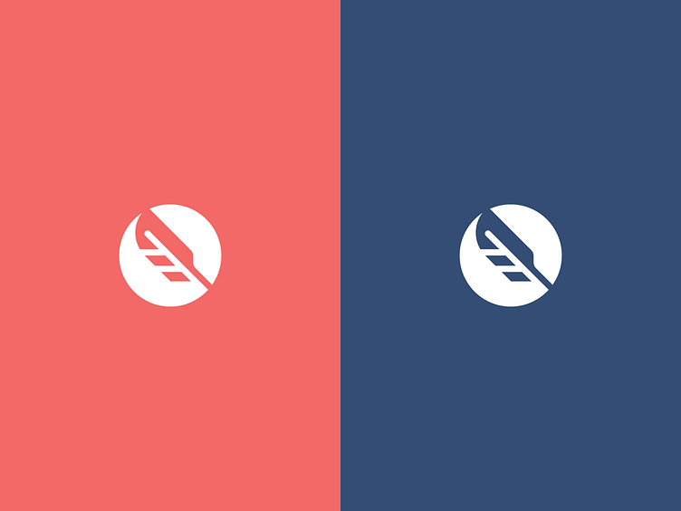
This is the concept of wisdom, which was my guideline and guiding idea for the design of the symbol. Although it is an IT company, with a focus on programming, the goal was to go a little outside the box.
A stylized feather placed in a circle is used as a symbol of wisdom and intelligence, and intelligent solutions are the focus of the APP IT company. The circle was taken for the reason that in the eye of the observer, the circle appears harmonious, it signifies harmony and unity.
If you have an interesting project or just want to say hello. Let's talk!