PICKUP LOGO/BRANDING DESIGN


I wanted to share one of the most recent Pickup Logo/Branding designs with you.
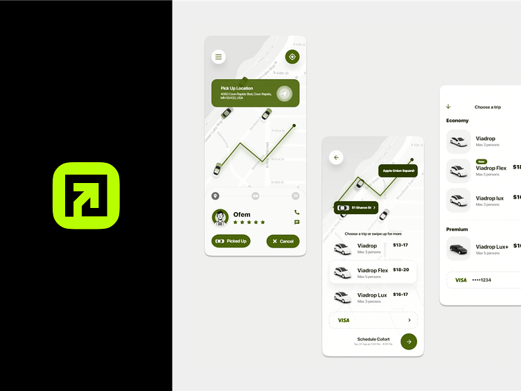
Pickup is a company that transports individuals to and from their desired places.
In the United States, Pickup Company is one of the newest names in the sector, operating a peer-to-peer marketplace for on-demand ridesharing. The firm runs multimodal transportation networks that provide users with customized and on-demand access to a variety of mobility alternatives.
During the research process, we came up with the concept of creating a strong symbol that would incorporate the core qualities that the firm was requested for while also displaying the business sector that the company operates in.
We designed a logo based on square forms that represent strength, efficiency, professionalism, and as well as an arrow that represents a path to pursue, and a feeling that underlines your company's ambition to go forward, accomplish new heights, and stay current with advances.
We built a form based on the two concepts that, when coupled with the two assets stated before, creates an abstract letter P, which is also the first letter in the company name.