Sangfroid! rebrand

For creative directors, the biggest professional challenge you can face is probably being asked to rebrand your own company. This case study by my Art Director, Paolo Bugatto, is an excellent retelling of our journey to rebrand Sangfroid! to reflect how the company had matured since its founding five years prior.
What the Brand!? Reflecting on a Brand Refresh.
At some point every brand reconsiders itself. That can happen for any number of reasons, from the launching of new products or a change of ownership, to outdated logos or sagging sales. Perhaps a brand needs to distinguish itself from the competition, focus its offering or simply get some much needed publicity. Regardless, if your brand is looking in the mirror pleading for a makeover, keep reading, this will help.
I’ve been fortunate to work with some of the best national and global brands. And, at Sangfroid!, we’ve grown to be quite good at building new brands and refreshing those in need. That said, when our founder suggested he was interested in refreshing our brand, the one he’d created with his very own hands as a startup only 5 years ago, there was a short silence. That pause is perfectly normal, refreshing your brand is a relatively serious matter. And what’s even more ominous, is the fact that you’re going to need to look in that mirror — long and hard. Like taxes, moving, or revising your resume it gets real — real fast. Refreshing your brand is a personal self-reflection and public evaluation. Laundry time. Closet cleaning. Purging. What sparks joy?
The great news was that even though we would need to be very honest with ourselves as the agency, we were also the client. Nice. So what follows is some of what we went through with our brand refresh and redesign, what we discovered, challenged, embraced, avoided, accepted, and accomplished.
If you’re considering a brand build or a refresh, you’re not alone. Here’s our take, our refresh, and the many pleasant surprises along the way.
Who Are You? Identifying Your Brand Archetype.
First off, we had an Archetype. Most brands have these. Basically, an archetype is a character based on a motivation that you align your brand with, identify with, and use as a north star or source of inspiration.
We put ourselves through our own archetype workshop on this essential starting point as a matter of process, much as we might with one of our clients. Instead of reaffirming who we thought we were (Magicians), we realized we had grown into someone else; Explorers. This was good to know and would serve us well as our refresh had something new but true to guide us — a tremendous restarting point. Read Jameson Pitts’ great blog on that experience, Branding Ourselves: On Archetypes and the Heart of an Explorer, for more on that.
Find your archetype, rewrite it, or get one if you don’t have one already. Start your branding journey with one and keep referring back to that realization along the way to ensure you don’t lose your way.
What Are You? Crafting Your Mission Statement.
Next up was revisiting our mission statement. But first, let’s think about yours. What’s your mission statement? Do you remember it? Do you have one? Do you need to revisit that as well? If you have a mission statement, reread it carefully to see if it still jives with who you are as a brand, what you are doing, and where you are going. Don’t confuse it with your tagline — seriously, that happens (although rare, it is possible to hit the jackpot and have your mission statement also serve as your tagline).
If you can’t answer these questions, run them through a workshop. Remember if you’re going to do this refresh thing do it right and don’t cut corners or assume whatever was still is. If your statement continues to represent your brand, then perfect, check that off the list but keep it in mind. Sangfroid! was growing in size and expertise, thus we needed to revisit our mission statement and gauge where it was at, if it would hold up still. Good thing we have a workshop for that as well. We challenged our founder by asking him a series of questions:
“How have our business, products, services, and values changed or evolved?”
And, “Why are you doing what you’re doing when you could be doing anything else?”
With this feedback, we visualized our brand through collaborative keyword exercises, distilled the word pile to a handful, and applied their essence to craft a statement that was clear, concise, and actually useful in defining our core message. Following the writing and rewriting of many, we arrived at our mission statement, parked it next to our archetype to see if they played nice together, and moved on. You can read more about our mission statement in the blog on that subject by our senior copywriter, Ruben Paquian.
Who Wants To Know? Reaching Your Target.
Yes, we are still talking about a brand refresh, but the sum of your refresh is only as useful as the parts that guide you. As we came to some terms about who we are and what we do, we needed to check back in on our audience.
We created updated user personas for those who would want and need our services. These extensive bios informed us and inspired the unique messaging framework we would develop for each. What’s noteworthy here is that as much as your brand is a reflection of your organization, it’s also a reflection of your clients: those who receive, engage, consume, share and reinvest in your brand. They don’t define you, but can certainly influence how you are defined.
Although not our intended audience, we considered the competition strategically by amalgamating an inventory on various local, national, and international peers to pulse check their brand positioning, priorities, services, and character. This research would ultimately prove useful creatively as much as strategically, or tactically. So consider how your archetype, mission statement, and messaging framework interact and react with your audiences. Put as much care into these foundational facets as you might your logo, color palette, and copy.
Which brings us to the more glamorous side of a brand refresh and brand redesign…
What Does That Look Like? Picturing Your Brand.
With increasingly reliable sources, harder facts, and mounting evidence, our investigation into ourselves continued. Creatively we accumulated references, did research, and scheduled brainstorms with every free minute. We stepped away from the mirror for a moment and looked around us locally, nationally, and globally.
As creatives, we asked ourselves what brands do we love, envy, dislike, and why? We shared logos we admired and websites we envied. Since we were also the client, we asked ourselves: If we could choose to look, feel, speak and act as a brand in any way we wanted, what would that be? How could it reflect us as people, a culture?
We wanted to visually become a brand that was unique, exciting to work with but practical and flexible. We wanted a voice that was fun, engaging, trustworthy, and conversational. We composited this information into a collage of words, pictures, and links. We then cross-referenced this back with our workshop discoveries, statements, and archetype insights to ensure we were being honest with who we were becoming; because it was quite different from where we came from. We were more diverse, expressive, creative, experienced, knowledgeable, factual, driven, agile, and multi-disciplined.
How Does It Become Reality? When Your Brand Comes To Life.
The signature assets that were to represent our refresh came together holistically. This was no happy accident. It came to us because we had done our homework to this point, and that included workshop processes that deliberately asked our founder what it was about the current or incumbent brand that was relevant, precious and why? What was off the table, up for debate or open game? We needed those honest answers in order to proceed. We didn’t stop with him but extended our questioning to the broader team for more input. Due to an immersive hiring process, we have great people who are a direct reflection of our culture and our DNA, so naturally, we wanted to know what mattered to them. What did our brand mean to them and why? The results were fascinating. Revealing. Informative.
A Cleaner Name: Drop the Marketing Studio
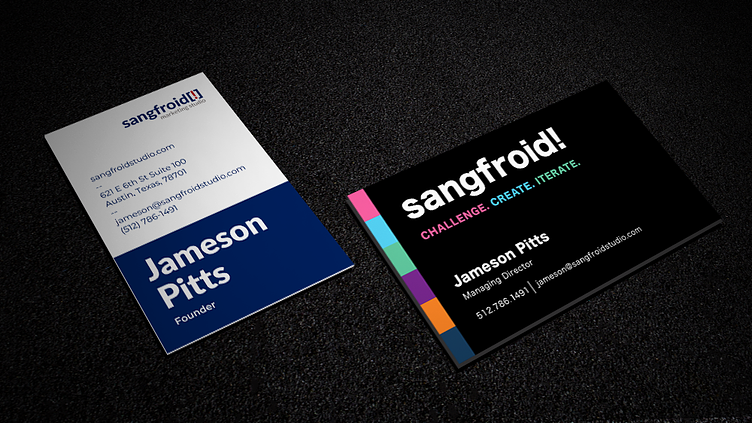
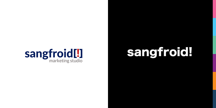
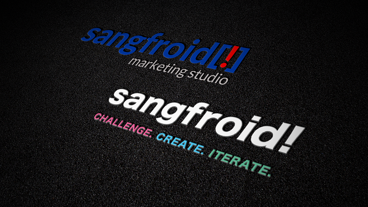
First, we simplified our name. Formerly known as Sangfroid Marketing Studio, we dropped the “Marketing Studio” because it boxed us in. We were now capable of much more, and as Explorers, we didn’t want the trappings of agency semantics that change with the tides of industry trends.
So we were now Sangfroid only — but not quite. We had a mnemonic in the form of an exclamation mark bookended by brackets from the original brand that we still liked for its graphic handiness and enthusiastic personality. We freed it from the brackets and added it to the end of our name, and went lower case ‘s’ in our wordmark for good measure since we agreed we wanted to be energetic but not obnoxious. That immediately translated to an even simpler short-form brand mark of “S!” — which we knew would be wonderfully useful for numerous applications. So we were now ‘Sangfroid!’ or ‘S!’ for short.
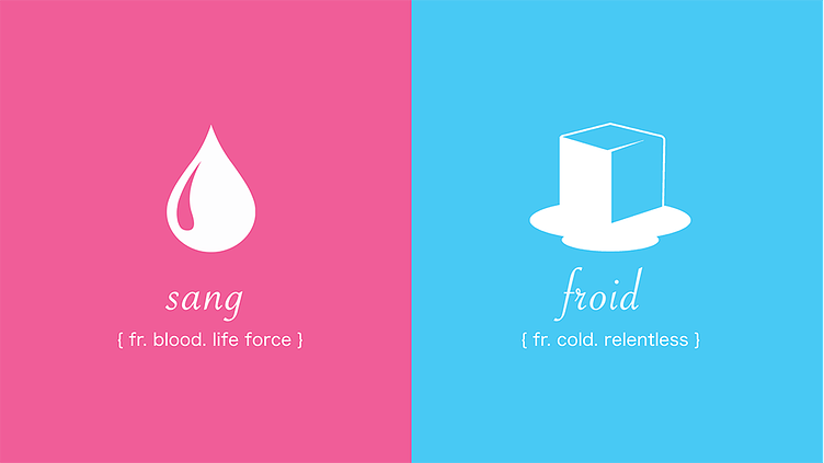
But we weren’t done with our name. We finally addressed another insight that suggested many didn’t get what Sangfroid! meant and how it was pronounced. Was it the founder’s last name or a music group? It was neither but had equity, was one of few untouchables, and had a back story. It’s actually two words in the french language that translate to “coldblooded”. Cool for a startup five years ago yet still perfect for an agency that welcomed the curiosity and confidence inherent. So we called out our name with a smile and made a point of its meaning and pronunciation (sang-fro-ah), weaving it into our maturing brand package.
Three Words. One Mission.
This also connected well to our new mission statement: “Challenge. Create. Iterate.”, (I mentioned we would return to that). We hit the jackpot with that one as our mission statement doubled as our tagline and now appears under our logo wordmark when appropriate. Yes, we wanted to be approachable and conversational as a brand, but we also were determined to cut to the chase here and deliver our core message as one that was poignant but purposeful.
Our mission statement is a reflection of our process: we challenge conventions and preconceptions, remain hungry to rise to the occasion, and create bespoke solutions that we’re never afraid to iterate in order to maintain perfection. We captured and packaged the mark (aka logo) and tagline (aka mission statement) in a uniquely hearty, modern font which was created in Japan but is readily available in European characters. Again, we cover it in depth in our blog on the subject.
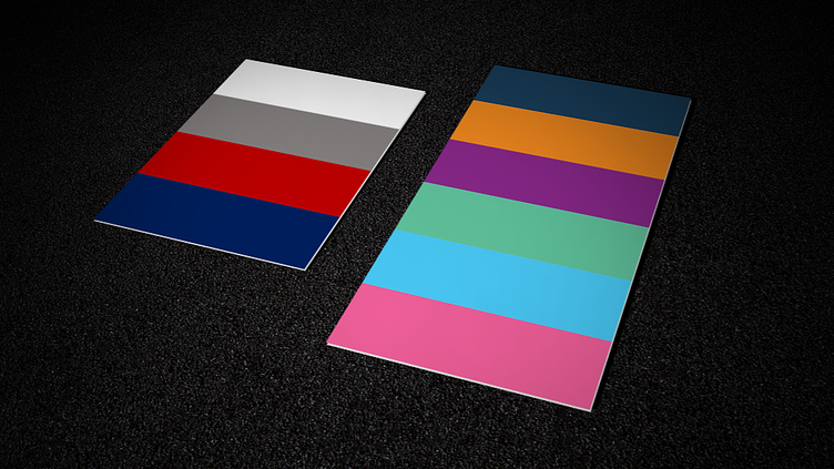
On Color: Don’t Be Shy!
For our color palette, we went colorful and bold. Just like us. Once again, we didn’t just make this stuff up. This understanding derived from our very own brand workshop processes, which then informed and became our brief. It was important that our brand possess the ability to remain flexible, nimble, and full of life and opportunity. Because we practice agile marketing and offer a complete range of skills and services for an equally diverse client portfolio — we simply would not accept the convention that we are identified and limited by one or two colors. It was essential to be adaptable, diverse, and expressive. The result was a brand color palette composed of six (yes six) various complimentary colors that would work well on their own or in any combination, and look especially perfect on black which became our base or grounding. Like a try of paints or a pack of markers, our palette must inspire creativity, not constrict it.
Equally, our voice, our words, and our copy quickly followed suit. The tone was to similarly be a reflection of us as a people, a culture. Approachable, conversational, sometimes funny, maybe quirky, but always honest. An advisor, a friend. Trusted because of our confidence and experience, appreciated because of our passion and care.
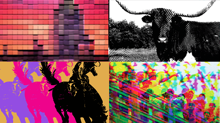
When it came to brand imagery, we continued with colorful and bold and kept in mind the value of owning a look when it came to pictures representing this refresh. Being born and bred in Austin, the brief wanted the brand to honor its roots. Using various design styles, we mashed media and created a series of iconic representations of our home, culture, and personality.
How Do You Know You’re Done? Completing Your Brand Refresh and Redesign.
Like our language, logo, colors, typesetting, and imagery came together in a series of artboards it simply made sense. Sure we tweaked things, set some compositional parameters, added some signature characteristics like bold statements and an icon set style, but it was all there. We had been internally updating along the way, doing pulse checks and always referencing back to the workshops which had provided so much intelligence that we knew we had arrived on target. What started as a brand refresh at times felt more like a brand rebirth. Were we going too far? Was this becoming a rebrand?
No. As the client, we had to trust the processes, and as the agency, we needed to execute without biases. We were deconstructing and rebuilding. This brand evolution was a re-assembling of the preserved, the changed, and the added. Questions were producing answers. Answers provided direction. Direction rationalized decisions.
The end result was a brand guide that truly tells our story as a people and a brand. And as designers, we love working with it. It’s as flexible yet practical as we had hoped. The result was not expected, nor predetermined. We arrived here both theoretically and organically applying our own processes and trusting teamwork.