VIKA OG FILIPSTAD

Logo Design for a Norwegian Sports Club
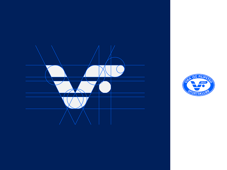
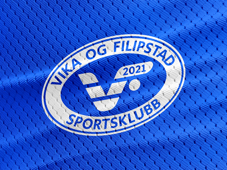
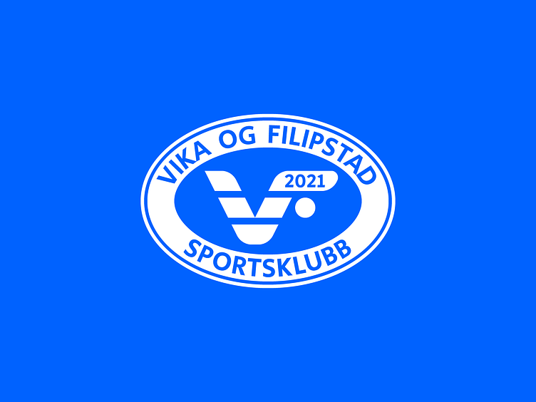
VIKA OG FILIPSTAD Sportsklubb
Combines:
● Monogram of V&F
● It started with floorball first, so the letter F is designed accordingly
● Monogram as a seagull shape, and with lines symbolizing sea pattern - because both Vika and Filipstad are close to the water
As a result we have got the airy and moving logo as it suits sports
Creative Team:
Maka Dolidze
Irakli Dolidze