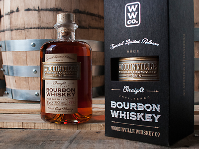
"Woodinville Bourbon Whiskey" by David Cole
Artist: David Cole
Client: WoodinVille Whiskey Company
The judges chose David Coles' "Woodinville Bourbon Whiskey" design as the Runner Up for it's classic sophisticated appeal. While the label contains a lot of information, care was taken to prioritize the copy in a way that leads the eye through the design. From its deeply stamped metal foil stamp to the understated black box, the customer knows that this is more than just a whiskey. It's a work of art.
Read the full interview at:
http://www.letterheadfonts.com/gallery/2014runnerup.php
Fonts used: LHF Woodmere™ & LHF Packard Script™