Lodge Cast Iron
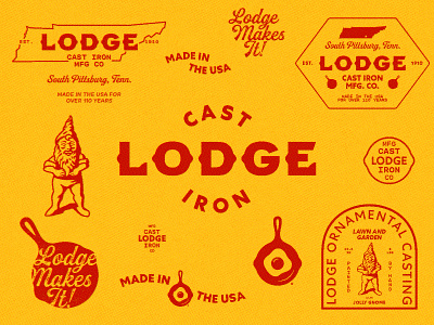
This self-initiated project came about after I saw the packaging my Dutch oven came in. I thought it was a shame that a company with such a long history, didn’t have a logo that fit it better. In addition to redoing the logo and adding secondary elements, I expanded on the existing brand colors, refined the pan with egg mark, and reintroduced a gnome from Lodge’s product history.
The word “LODGE” in the logo is custom-made. The font for “CAST IRON” in the logo is Centra No. 1 by Sharp Type. The rounded monospace type used in the secondary elements is GT Maru Mono by Grilli Type. The script is Buinton Rough by Mika Melvas.
branding
cast iron
cookware
design
gnome
graphic design
identity
illustration
illustrator
lodge
logo
script font
tennessee
texture
typography
vector
View all tags
Posted on
May 31, 2022
More by Tom Rosha View profile
Like


