Lemon Up Logo Updates

Hello Everyone,
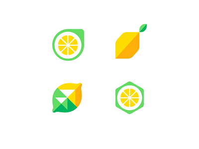
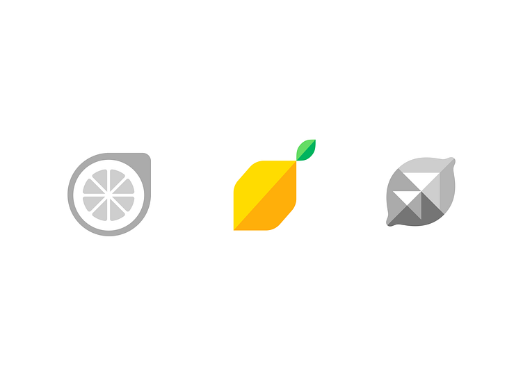
Recently I have posted some logo explorations for LemonUp — eLearning Academy. After agreeing with the client on the best option for the logo (highlighted in the shot bellow) we agreed it could be further developed so that it's closer to the brand.
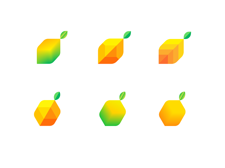
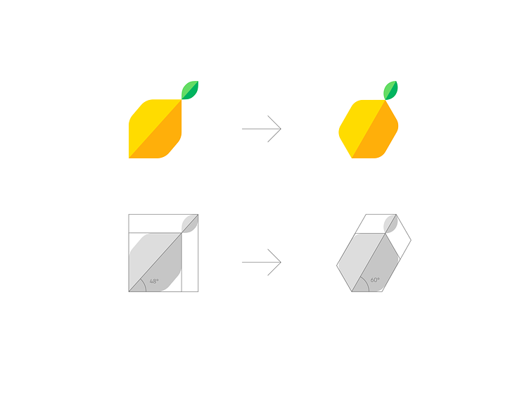
With the chosen logo as a starting point I have reworked the geometry a bit, so that it points up in a better way, also the symbol is a bit more open and clean.
Special thanks to Vadim Carazan for suggesting the update.
With the two versions, I explored some ideas regarding a more digital logo that would better convey the message of Levelling Up, Upscaling and eLearning.
These are the final options.
Feedback is appreciated, you are welcome to name your fav in the comments.