Emily Bazalgette Round Three

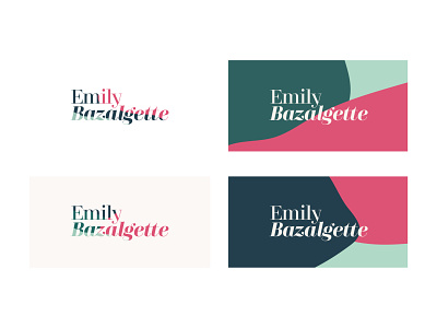


Emily found round two was a little too modern and reminded her of a recruitment agency so I toned down the hot pink and made the bold decision to ditch the monogram.
Instead, I focussed on expressing her multi-disciplined business using a typeface in different weights and in regular and italic type. I also used the organic shapes as a background and a fill of the typography.