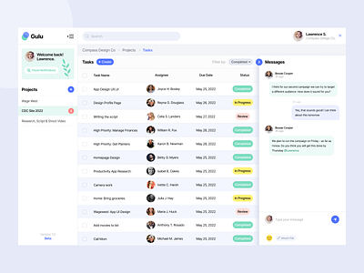
Productivity App UI Concept (Tasks)
So here’s how I structured the page. We have left hand sidebar to quick access the projects & preferences. Middle area is where we have the tasks showing up. I took extra care of the screen space as it is a productivity app and it can get really information rich. So using screen real estate wisely is a challenge here. So I invested sometime to figure out our grid system. On the right we have nice, minimal collapsable messages. When messages are collapsed, It will leave more space for the checklist to expand allowing us to add more information into the task row. I created a smart identity (dummy name: Gulu) to create a meaningful design around it.
Do you have a similar project to work on?
Drop me a message here on dribbble.
Or email me at: kasim@compassdesign.co
Instagram: @uxkasim


