Cirrus - Brand Application


The client
Cirrus capital is an investment bank that provides capital raising services for growth debt and other non-dilutive capital instruments.
The solution
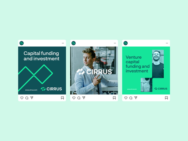
The idea behind the brand mark was to create something simple and unique that would represent the company very well. I combined symbols like growth, capital funding, and the company's initial letter C. Actually, after some discussion with the client, I change the typography to all capitals to make the logo look even more unique and memorable.
Your thoughts and feedback are welcome.
--
Have a project in mind? Let's work together!
Get in touch usman@kickstudio.co