


Mobile Navigation Concept

Last week I was lucky to attend An Event Apart San Francisco and a fantastic full day workshop about mobile design with Luke Wroblewski.
We talked about navigation a lot and the struggle that is a top-left "hamburger icon nav", especially on large screen smartphones. Luke showed us some great practices using the main navigation on the bottom of the screen (which is obviously easier to reach with your thumbs) on mobile apps.
And I talked with him about wether or not it was a good idea to have those principles on websites as well. He didn't have data to analyze the affordance or the usability of this pattern but encouraged me to try it.
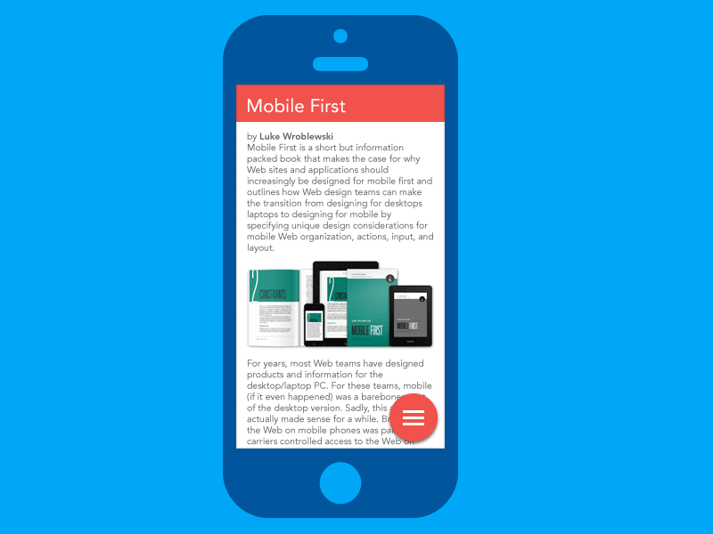
So I decided to try a pattern with a navigation menu on the bottom of the screen.
Key principes
• This follows the concept "content first navigation second"
• The nav button is at the bottom but being sticky helps to see it
• and its affordance is strenghtened as an "action button" like the buttons we cas see in Apps following Google's Material Design principles
• Placed at the bottom of the screen it's easily reachable with a thumb, even while holding the phone single hand, even with a large smartphone
• On the bottom right corner of the page, it's placed at the location it's less disturbing for the reading of the page
• Following this concept, I also inverted the order of the navigation. The most important pages are at the bottom, making them easier to reach.
TL;DR: I tried to explore a new concept of navigation a website by placing the nav at the bottom of the screen. This improves the UX of the site on large screen smartphones.
Don't forget to (re)read Luke's article Designing for large screen smartphones
So, what do you think?