Unsolicited Mascot Project

In my spare time, I enjoy creating unsolicited sports rebrands for universities and high schools. For some, I create a full-on redesign of their logo or mascot. Others just get a slight refresh or an evolution of their mark. The idea was to bring them up to date in a manner that respects the past but builds on the reputation of the program. This redesign was for the Norfolk State Spartans.
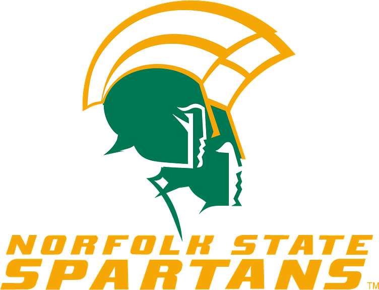
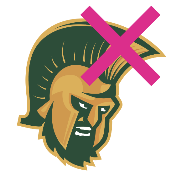
It was clear that their current mark hadn't been updated in years. It had a late 80's or early 90's design feel, and there was so much going on, but it wasn't a bad design by any measure. I loved that there seemed to be both male and female versions of the spartan, and the profile line-work was something I wanted to try to keep if possible.
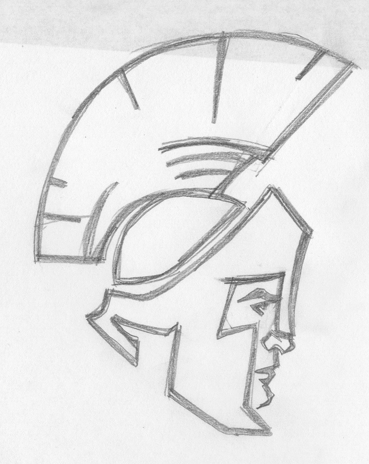
The first versions were an attempt to capture the spirit of the original. A figure in profile with a single stroke weight. I loved the sketches and thought these had real potential, but when I translated the sketches to vector, something was lost. I couldn't strike a balance between the simplicity of the concept and the details I felt were important. Once I brought this design into the computer, things fell apart quickly.
I had somehow managed to destroy the charm of the original while also losing all of the interesting details I thought would update the mark. And when I explored the application of the design to mockups, it was even worse. I took a three week break so I could come back to it with fresh eyes.
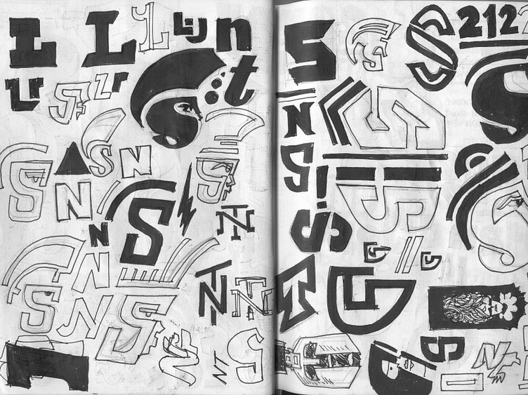
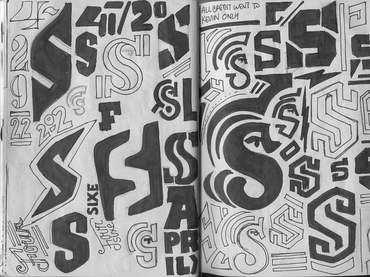
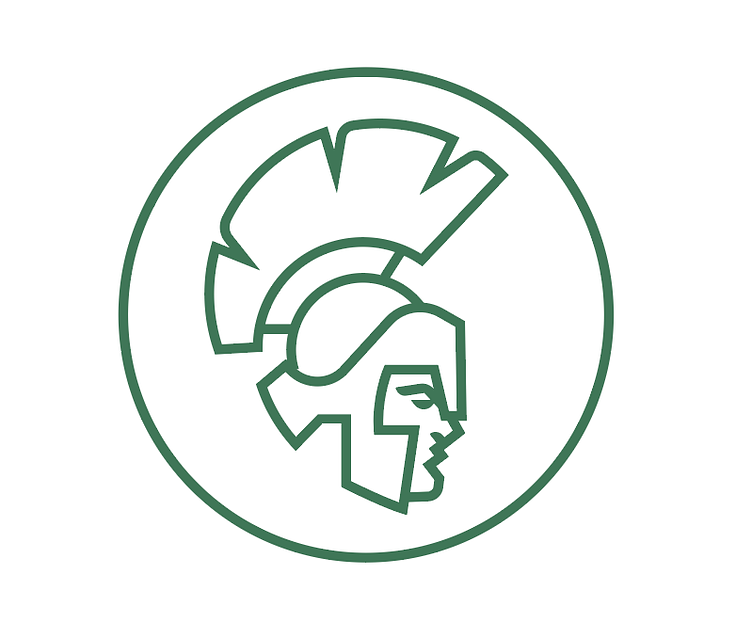
My new approach was to focus on typography instead of iconography. I created dozens and dozens of versions of the letter "S." I even tried combining the letterforms with the profile single stroke approach in various ways, but all were ultimately very clumsy. I decided to re-approach the spartan as the focus, one more time.
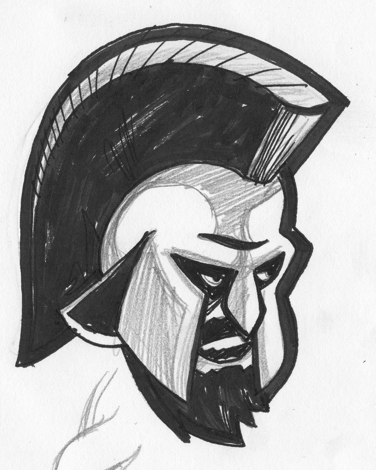
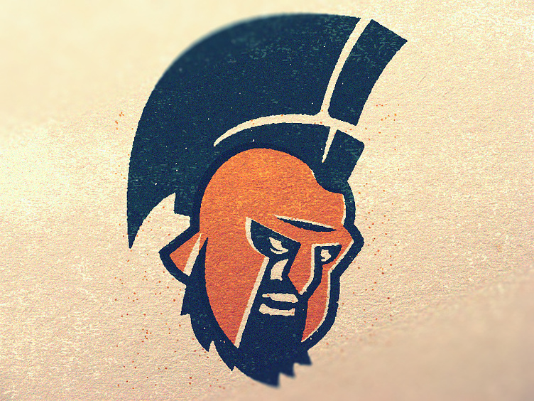
After some feverish sketching and re-drawing the figure again and again, I began to find some things I really liked about the approach. It's more of a departure from the original than I would normally prefer, but I felt that this new concept was a better representation of what was happening in the world of sports branding right now, so I went with it.
Everything was going well until the dreaded plume. I can't explain how I struggled with that broom-shaped nightmare sitting atop the spartan helmet. I was on the verge of giving up entirely until I found inspiration from a fellow dribbbler. Thanks to Ikhwan Hakim and his amazing Roman Soldier Logo I had a better approach for the plume. After some adjusting, I got something I liked and the update was complete.
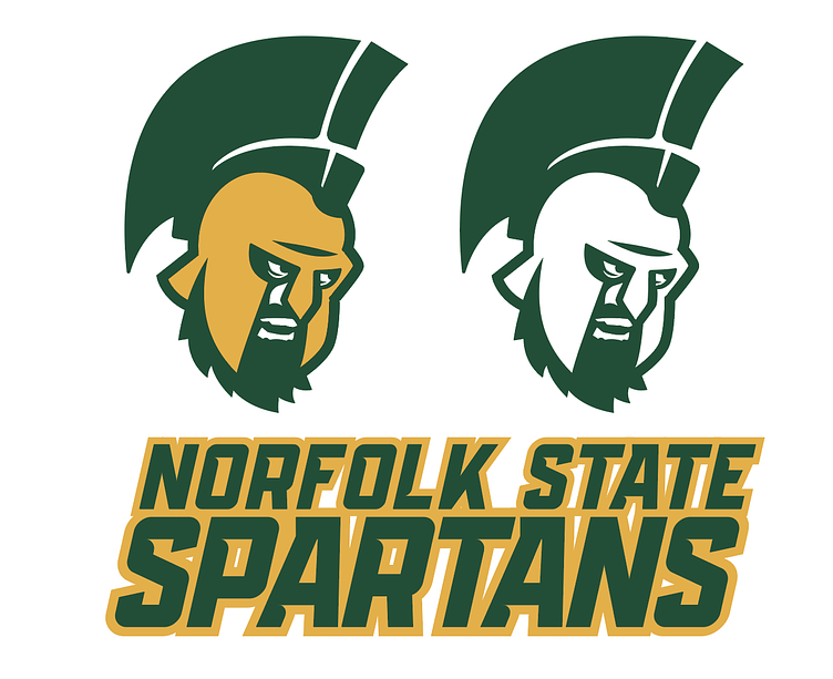
This is where I ended up. It's not exactly what I was hoping to achieve when I began this project, but I learned a lot about being flexible in my process and going where the inspiration takes me. It's never a mistake to explore as many concepts and ideas as possible, and if those are all dead-ends, always take the chance to revisit work that you abandoned. Design is more than the final work you present, it's the story of how you got there.