OPG Marinovic logo and honey jar

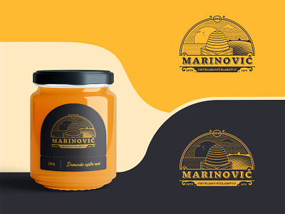
Logo re-design for a honey producer OPG Marinovic. Main elements such as bee hive, sun, sky and the sea from the old logo had to be kept as they represent farm's strong connection to the local landscape.
http://opgpcelarstvomarinovic.com/
_________________________