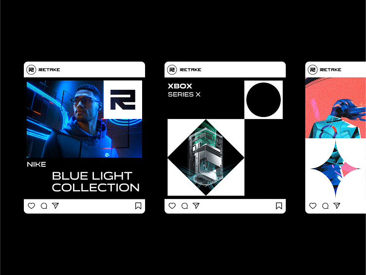
RETAKE LOGO/BRANDING DESIGN


RETAKE /BRANDING DESIGN
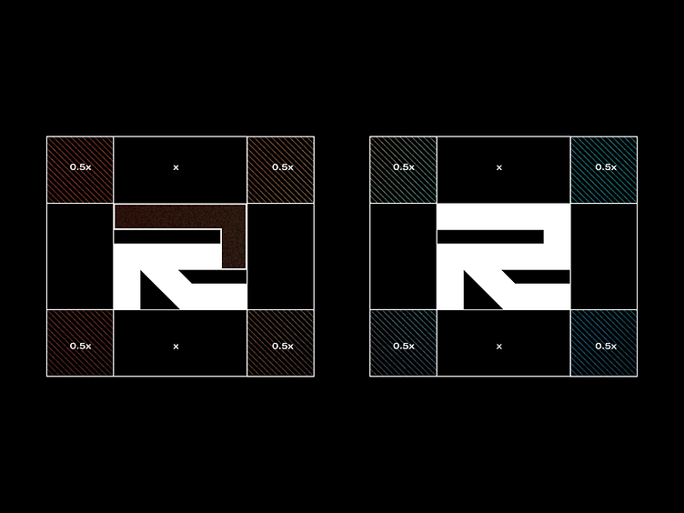
This is one of Retake most recent logo/branding designs.
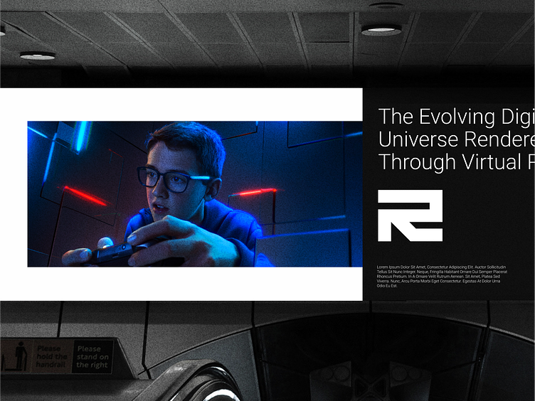
Retake is one of the most recent Gaming lounge to be founded in Portland.


The customer wanted to create a more abstract brand that was free of the limits of typical letter R logos and evoked a gaming industry mood for the clientele. The goal was to move beyond the customary and explore abstract feelings, such as the tech side of things and the initial letter of the company's name, R.
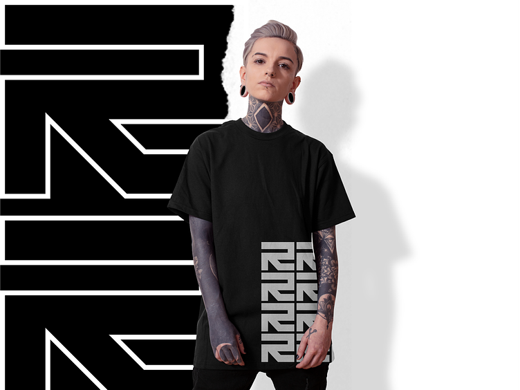
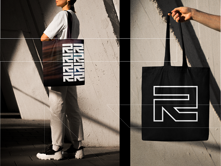
We came up with the notion of merging the Letter R with the Arrow Symbol after a lot of sketches and ideas.
The visual of an arrow, despite its simplicity, may transmit a vast range of meanings you've never considered. An arrow, for starters, symbolizes your company's desire to advance, reach new heights, and stay up with technological advancements.