ZIRX

ZIRX is an on-demand valet parking app, which currently operates in San Francisco, Seattle and is expanding rapidly to other cities in the US.
We started working with their awesome team in July, we've been iterating on their identity and coming up with some really great results.
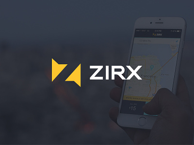
The ZIRX logo features two navigational arrows close to each other, meaning two things: the 'meeting' between the valet agent and the user; and also 2 cars parked close to each other.
But the real visual object behind this is the letter Z, which I've tried to build into the negative space between the two arrows.
Credits go to:
@Matthew Lenzi for putting together some great, authentic photography and bringing the brand messaging and strategy to the next level.
@Sergei Tatarinov for moving the website styling forwards with a bunch of new iterations.
And of course, the ZIRX team for some great collaboration and support. It's always nice when your clients are this great to work with!
I was in charge of building out the identity, including illustrations and iconography (stay tuned for those--I'll be posting them on here, soon!).