GritWorld - Project Case Study


GritWorld GmbH was founded in December 2015 by Dr. Wu Xiaomao in Frankfurt am Main, Germany. Shortly after its founding, several top investors joined in. Now the company has new offices in Shanghai and Guangzhou, China, to support their Chinese clients.
Their core development focuses on real-time graphics & rendering technologies and real-time large-scale 3D reconstruction technologies, summarized as their digital engine. The current applications on top of the digital engine target different industrial fields including cartoon animation & film, smart city management & industrial simulation, high-dimension data visualization, large-scale commodity digitization, and advertisement. In these fields, they promote digital transformation, improved production efficiency, and the user experience.
Through healthy growth, GritWorld has hired a strong international team with members from 18 different countries to develop their core technology in their headquarters in Frankfurt.
The Challenge
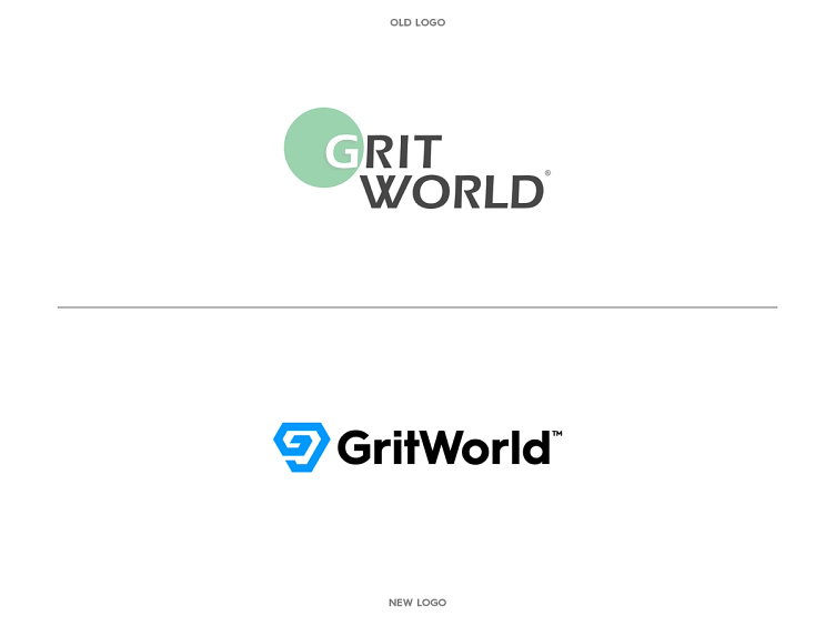
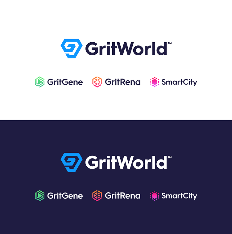
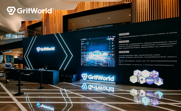
GritWorld's current logo was very outdated and because they had big plans to grow and expand their business, they needed a new logo that fitted this goal. As some new products were created as well, the idea was to use GritWorld as the 'umbrella' main brand, and some of their proud products to be used as sub-brands. These sub-brands also needed to fit together as a family of logos.
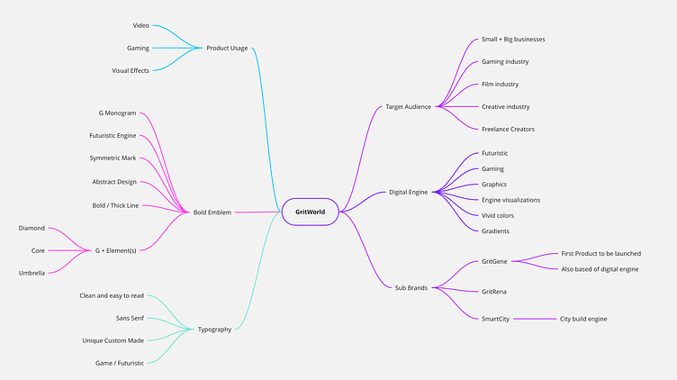
Mindmapping
At the starting phase of each of my projects, putting thoughts and key facts about the project on paper is an absolute must to get a wide view of the project and where the possible chances lie. This also triggers any potential new directions and opens up subjects to talk about with my client. As the brief made already a lot clear about the goals and products they were planning to launch soon, the purpose of this mindmap is to also summarize all the important elements in order to have a solid start at the potential first concept directions.
"I helped GritWorld find its true core identity by mixing some of its key elements and turning it into something bold and solid. The power of storytelling in brands is so important in finding the sweet spot in creating such an identity that stands out from the crowd."
My Approach
The main importance when designing a visual identity is to get to know the company and the people who work there with much passion and joy. Once I know the company and its people, I dive into the users they are targeting and are using their services. Doing research on specific competitors is important to be aware of, as we do not want to do what others have already been doing. Next to this, I also put together a mood board to determine a visual preference with my client. Putting this all together gives me the opportunity to write out a plan and list of focus points to start working on my first concept ideas.
In most of my projects, I offer multiple presentation rounds. After each round of concept presentation, the client gets the chance to share their feedback and point out specific revisions on a concept to further explore the concept. In these 'creative' phases, I tend to be flexible to not limit the creative outcome. While making sure to keep on-brief and on some occasions a little off-brief to get more experimental and potentially surprise a client with a specific concept.
"When going off-brief, I potentially can find a concept that brings in new and experimental ideas. This part I really enjoy as the outcome often is unknown and excited. As a creative, this is a good part to stand out and show off my skills in concept development. I tend to be a designer who not always listens, but also has his own voice in design development."
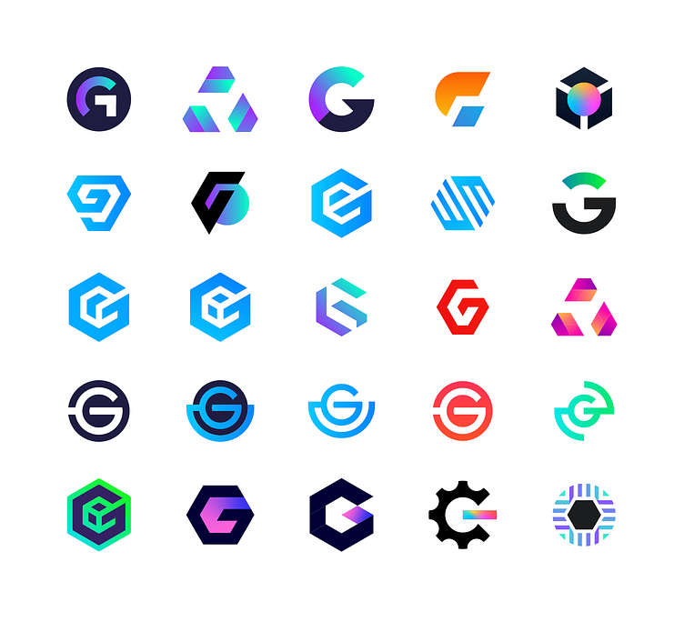
Visual identity
During the first conversations with the client, the main importance was to upgrade the logo identity to visually represent their current status and beliefs. As the company has grown a lot over the years and also had expending, something more timeless and bold would be much more appreciated. By going for strong and bold visual elements, the new identity for GritWorld needed to be a good fit in this. Often seen as a futuristic and technical industry, focused on creatives and development industries was also important to keep in mind in finding a perfect identity for the company. For the main brand, GritWorld, a visual stong emblem was preferred to achieve. As for the sub-brands to fit easily next to it. Colors needed to be vivid and fresh. But with the goal to keep it professional and still futuristic-looking and easy to use in black and white.
"It's such a wonderful feeling when you land on a concept that just clicks. The creative journey is so exciting and can open up so many new doors in concept development. To be experimental and thinking out of the box can often be really rewarding."
Typography
When it comes to choosing the right typography for a logo, I often focus on what I want to achieve with it. I always look for a font that complements a logo mark. To keep things visually balanced and technically correct, I tend to go with clean and strong-looking fonts. Sometimes I adjust the font to make it fit the identity better. A font family I really love for its strong appearance is Hurme Sans Geometric. This font is a Sans Serif font which is really well to read and easy to customize to fit a brand symbol well.

Testimonial Client
Jeroen was tasked to help GritWorld rebrand and redesign our logos. Firstly, he was very easy to work with. He was very creative, open to ideas, very flexible, and always went above and beyond to help us with our problems or give us valuable suggestions. What impressed us the most was despite many iterations of feedback and modifications, he was still very patient and adaptable and managed to come up with a range of creative solutions which eventually helped us get to our final goals. It was a joy working with Jeroen and thanks for the amazing work you have provided.
Jack Kor, Junior Project Manager at Gritworld GmbH
Interested in working with me? Feel free to say hi via: info@jeroenvaneerden.nl