Lamp Icon Submissions

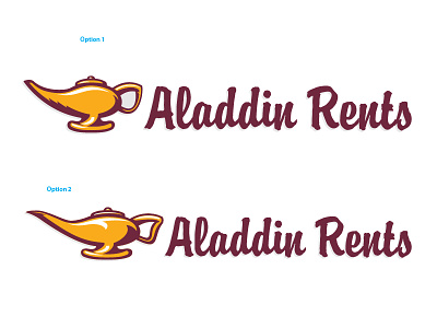
These are the two slightly different submissions I turned in to a client this past weekend. It was under strict guidelines that I keep using the typeface Brody, and keep the overall maroon color.
The lamp was obviously my main focus, as they had only used clipart in the past. My main goal was to not go for a traditional take on the lamp design, but to make it look more like a gold trophy, showing off that their business is the best. While I have a biased choice on which icon to use, I am interested in any other choice/opinion.