Type on a curve
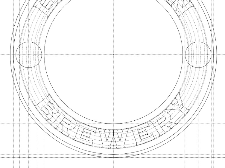
The resistance to change was strong with this project for obvious reasons but tidying up the type on the curve was a necessity in my humble opinion and contrary to what a couple of people think does no harm to the brand, in fact it amplifys Glaser's original concept of the B. See more here: https://robclarke.com/work/brooklyn-brewery/