


Branding - Novao Technologies

Introducing... Novao. We breathe open source, and sometimes we get a little weird because of it.
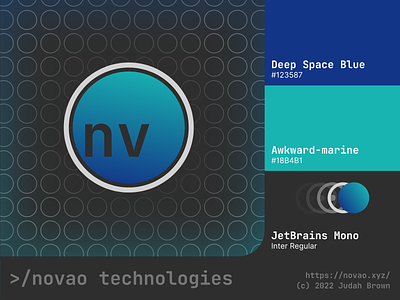
Novao's brand was specifically meant introduce the craziness of the company into the personality. I used circles for the logo because... Well, circles are fun. The interior circle with the letters in the corner is meant to represent an element on the periodic table, while the colors of the gradient (Awkward-marine and Deep Space Blue) are meant to give off a very space-like vibe.