Lifesmart - Smarthome Mobile App - Dark Mode
Hello guys 👋
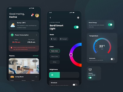
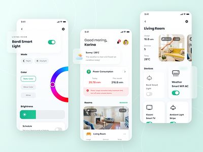
This is Dark mode version for Laude Pirera's latest Smarthome App Design. On the preview image there are 3 screens: Dashboard, Room Detail and Device Detail.
In the dashboard screen, the main idea is to bring some AI notification to user like weather information, air pollution and power consumption so the app can give user advice to take action.
Second Screen is Room Detail Screen, the concept is to display power usage and temperature information, then display the cctv video with slider concept so that users can move from one camera to another camera in the room easily. Then make a devices list into card with the switch button to turn on or turn off room device quickly.
The last screen is Device Detail Screen. It will vary according to what settings are available on the devices.
Which one do you like? Light Mode or Dark Mode? Please write your answer in comment below 😄 And don't forget to leave your feedback too!
Press L if you like it.
Thank you.
Our Product | IG | TW | FB
---
We are Agensip, a creative digital agency focusing on UI and UX stuff. Kindly visit our website at www.agensip.com to see more detail about us. Never hesitate to contact us via email at hi@agensip.com


