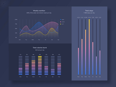
Charts - Lifestyle monitoring App
The correct choice of colors is an essential aspect when creating impressive charts. A well-chosen color palette will transform your data into a story, not merely numbers. And vice versa, poorly matched colors can distract the user from crucial information.
Dynamic gradients make the data look dynamic too, and this effect is of prime importance when designing a lifestyle monitoring application.
Our designer’s tip: Remember to move your colors clockwise around the color wheel. Gradients like the analogous color scheme created by choosing two or three colors next to each other on the color wheel. Analogous colors are well-suited for making gradients, as the transitions are softer.
View all tags
Posted on
Feb 25, 2022
More by CodiLime View profile
Like

