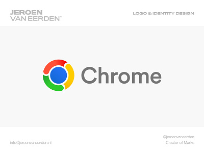
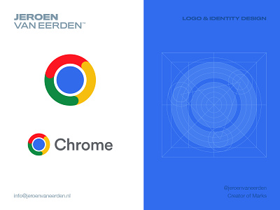
Google Chrome - Logo Redesign - Refined
Google Chrome Logo Redesign - Refined (unofficial)
Refined this concept after playing around with it some more. I feel these small gaps helps for scalability a lot. Added a soft gradient to push the flow of the mark a bit deeper. Personally, I really like this logo. Might be not super original, but in the line of what Google has putting out lately, this would be a good update for me.
What do you think? Like it more or too generic?
Are you in need of a logo (re)design?
Feel free to reach out via DM or Email:
👉 info@jeroenvaneerden.nl
brand identity design
branding
chrome
creative logo redesign
google
logo
logo design
visual identity design
View all tags
Posted on
Feb 9, 2022
More by Jeroen van Eerden View profile
Like


