Advice Media Homepage Concept


This weekend, I decided to finally take some time and dig into the redesign of Advice Media's website that has been on the cards for sometime.
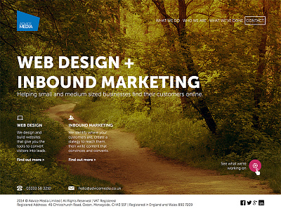
Over the last six months, I've had somewhat of a change of heart when it comes to the type of homepage design that dominates agencies at the moment. You know the one – long, multisectioned. A pick and mix of everything that the agency does, all on the one page.
The problem is, from an SEO and a conversion perspective, it's bad. The reality is that the home page should serve as little more than a doormat for those who've heard of your brand and have searched you out specifically/come directly to your website.
We provide web design and inbound marketing services (SEO, PPC, content marketing etc). I don't want people searching for my keywords to land on the home page – however, with those long, catch all pages, that's precisely what happens.
I want them to land on the specific pages I've created for those services.
That's why I've taking this very minimal, doormat approach to the home page. It has everything they need, but nothing to distract them and keep them on the home page for longer than is necessary.
It has a clear USP and the two service offerings are marked. We've also included a link to our dribbble page for those who want to see what we're working on. But other than that, it's all about pushing those who land on the homepage to the page that will do the best job at converting them.