nowhere house - final branding

Hi!
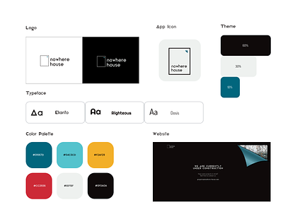
So here's something I've been working on lately - branding for an emerging software house. Main goal was to keep it minimalistic and modern.
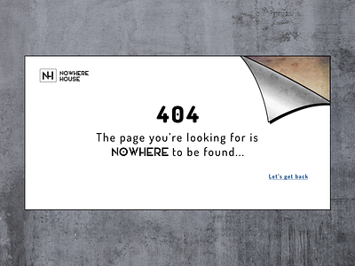
Logo is a representation of blank canva or frame, starting point for any project. Why blank? Because each project we're starting fresh, with clear head and no previous assumtpions. Meaning of triangle is simply shown at the website - its a representation of an insight, role of thorough research before making any decision.
What do you guys think?
_____________________________________________
Have ideas? Let's talk: