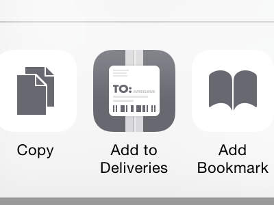
Add to Deliveries take 2

Hours of tweaking later, I'm pretty happy with this one. Took me a while to figure out exactly which details to drop. I only kept what seemed important for it to read as the Deliveries icon, and I tried to keep all the lines on a thick grid—though I cheated a bit when it seemed worth it.
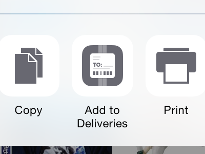
I ended up using a size that's a bit bigger than a lot of the icons, because the large white label means it would have less visual weight than something like the Add to Home Screen icon, which is almost completely filled in. I actually didn't notice the Print icon until after I decided on that, but it helped convince me I chose a good size.
Thanks everyone for the feedback!