


Instapaper Redesign


Last night for some reason I wanted to try to redesign Instapaper, just for fun. I only use it on my iPad, and started thinking what for me would be the most comfortable way to read a lot of articles fast.
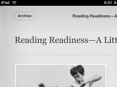
I've attached 3 screenshots:
1. The default view of the first page.
2. What it would look like when you pull up the first page (I'm not a big fan of scrolling long articles, I prefer dragging like in Reeder, or tapping the side area to go to the next page). Once you pull past the "Page 2" marker (or tap the right side area), the second page slides up.
3. The second (and in this case last) page.
Note: This is not me criticizing the current interface for Instapaper. Marco did a terrific job with it, and it is hands down the best app on the iPad. This was just me being bored for an hour or 2.