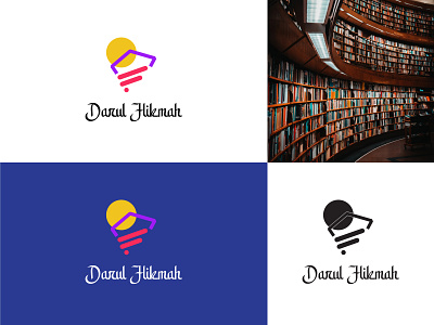
Darul Hikmah Branding Logo
Design concept: As you can see in the logo, I have created a shape of D for "Darul" on the upper side of the H which for "Hikmah". At the first time the H my looks weird as it is slightly rotated for the sake of keeping consistent. Behind all the shapes the circle represents the light of education.
Don't forget to like and share your thoughts about this design 😄
-
I'm available for freelance project:
------------------------------------------------
📩 : design.dollardope8@gmail.com
BEHANCE I FACEBOOK I INSTAGRAM I LINKEDIN I TWITTER I FIVERR I TUMBLR I REDDIT I DEVIANART
app
app logo
art
brand
brand identity
branding
creative logo
design
educational logo
graphic design
illustration
logo
logomark
logotype
luxury logo
minimalist
minimal logo
modern logo
typography
vector
View all tags
Posted on
Dec 3, 2021
More by Kazi Faiz Ahmed Jeem View profile
Like

