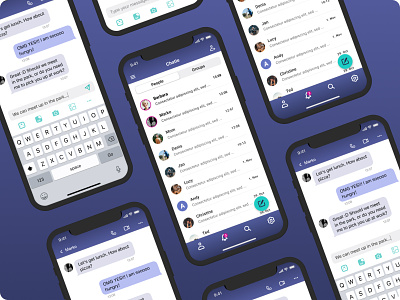
Navigation message app
NAVIGATION MESSAGE APP (as part of UI Learn by Denislav Jeliazkov)
The goal of this project was to design a messaging app, but with focus on navigation. I needed to include features such as profile, search, list of messages, notifications, and settings.
Challenges I faced and how I overcame them:
1) I was using too much colour and gradients which caused an issue that important actions weren't visible enough. I reduced the gradients down a bit and used a different colour palette to highlight important elements on the screen.
2) At first everything looked important to me. With the help of information architecture I could identify the most important elements. That became a foundation from which I built the visual hierarchy. I used white space, typography, size, and colour to spotlight important elements on the screen.
3) In the list of messages I didn't want to overwhelm the user with too much information. I used a list view, because it doesn't use a lot of space. Two most important elements were New Message button and a profile picture so users could easily identify a conversation. To make the button stand out I used a complementary colour.
4) In bottom navigation I listed only the essential points of entry for the user: profile, notifications, search and settings.
What I learned in this project:
1) How to use size and colours to highlight important elements.
2) How hierarchy of the elements impacts how people will interact with the product.
3) How to create a message app that is simple to navigate and fun to use.

