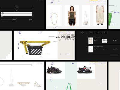
SS Inc. Headless Ecommerce: Responsive Design


Full presentation is available on Behance
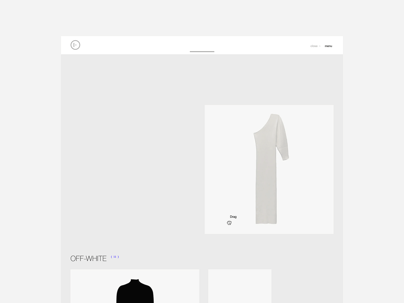
To ensure smooth operation of the site on all devices, we have set up breakpoints that cover all resolutions (desktop, tablet, mobile).
The design layouts are based on a micromodule system (4px). All values (margins, padding, line height, etc.) are multiples of four. This allowed for more fine-tuning of the layouts, in contrast to the 8px micromodule, which does not provide enough detailing.
Let's talk about growing your brand: hello@adencys.com