Misc.: App Icon Through The Ages

Wow I am just plugging away at stuff for Dribbble these last few days. I'm on fire if I do say so myself! Even making stuff on Thanksgiving, that's how you KNOW I'm a dedicated worker.
You ever stop to notice how app icon design changed over the years? Obviously this isn't anything new, these kind of shifts just happen over time. What was once bold and new becomes dull and old, people begin to look for the next big thing and the cycle continues.
I thought as another exercise I'd try my hand at emulating the change in app icons over the years with a mockup of my own.
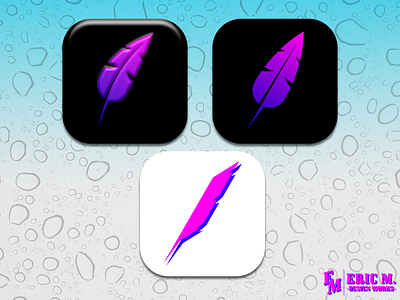
First we have the early years, where everything was bold and beveled. Shine and plastic-y as far as the eye can see.
Following that is the flattening. The bevel is gone, it's all about simplification while still keeping a shred of being recognizable as the app. This is where a lot of designs are at now, but some like to go FURTHER BEYOND.
At last, we arrive at MAXIMUM MINIMALISM. Slightly redesigned logo, gradient's gone but the tones are still there.
What can we learn from this? Beats me. I'm probably overthinking it as usual, but it's still nice to know where we came from and where things will go in the future.
And just to be super clear, this isn't me saying that one is better than the other. All design philosophies have their time and place.
For example, if I'm designing a logo for a million dollar mega corp., I'm probably not going to design something that's got a zillion gradients with bold comic like line-work. That might be a case where minimalism is better.
Anyhow, that'll do it for me right now. I'm going to try and take a few days off since I'm just a mad work horse. Peace to you and have a safe holiday~!
---