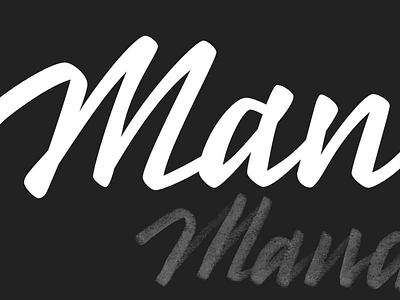
Mandae Lettering Rough

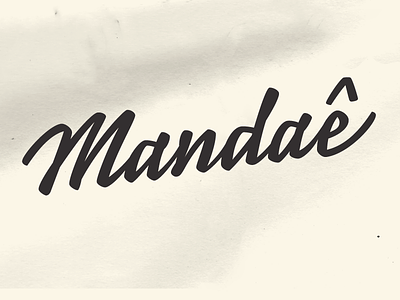
Forgot to post this one. Lettering comp we showed Mandaê before deciding for the @ logo solution in Mandaê. If this was chosen, many refinements would be made in spacing and shapes to make it final. Still think it has a nice flow to it but the final choice was more appropriate for the brand. Good idea 1 x Dynamic lettering 0 in this case :)