


Health Coach Brand Identity

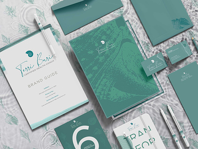


Terri Buri is a certified health coach, strengthening women in their 40s and older. The personalization of a script font made for a solid choice.
It gives an authentic feel supported by a strong serif typography giving the feeling of trust and integrity.
Stronger aspects of the brand revolved around compassion being able to align with the needs of the customer as they go along this journey.
Not only it's the brand now more approachable and friendlier but willing to look at things from a new angle of discovery.
Our bodies are 60% water, so growing and maintaining a stronger foundation using the grains as a mineral from the earth should be from a source you trust.
Color palettes of Mint Green along with shades of Teal visually capture the smell of the sea side as the primary theme.
Gotham, a geometric typeface, was the ideal choice for appearing fresh with wide counters and circular forms also provides a breath of fresh air.
With strong ties to fertility anatomy, Oceanic fossils are a recurring theme.
Also, the symbolic spiral forms into fractals completely in alignment with measuring on natural life cycles.
Getting down the core essence of the brand by doing brand exercises and creating an archetype is a great direction for getting her values in alignment.
We compiled a guide to help identify and bring key elements of the messaging together into a book sharable among vendors and team members.