Torrine

#dailylogochallenge #dailylogo
City | Day 22
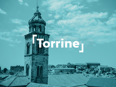
Brand identity for city of “Torrine” inspired by European living. I created a tagline, “say yes to Torrine,” since the name sounds like “touring.” I used the initial letter to look like a viewfinder frame since it’s a picturesque city. Coincidentally, the font used is called Apertura Black just like the word “aperture” when looking through the camera lens.
Stock images by Chris Curry