Brand Identity Design

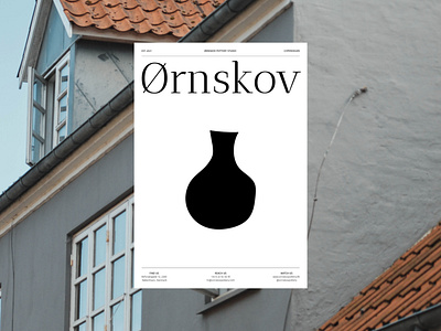
The text layout with a serif type and large clean spaces is unique and functional, it indicates exclusivity and reliability of the brand. The logo mark visualises a jug, giving a hint on the craft business niche by its "rough" style. The combination of a serif type in a typographic logo with a simple jug mark unites formality and informality. Such an approach allows target audience to perceive the brand as a classy label beyond trends that provides quality products and services for those who care about uniqueness and like feeling special.
Talk to me: contact@katezest.com and we will create a branding design for you that will be conveying your brand's values and helping your business grow.