


Simple Analytics

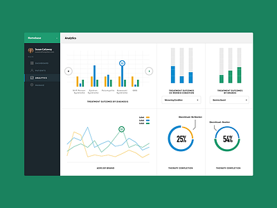
This is one of the looks I had in mind for the analytics dashboard for Homebase.
Introduced yellow as a tertiary color to support more than 2 values, and and also made each graph much more interactive.
Full-bleed fluid containers, real simple.
Next shot I'll be attaching a presentation deck that really breaks down the interface components.