Comparing n's

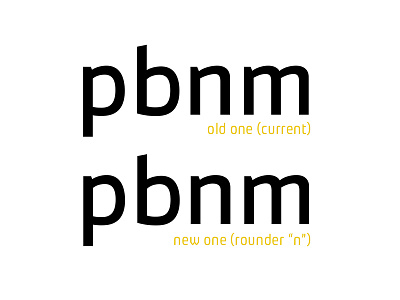
Well, I've made a new "rounder" "n". On top, the current one. Below, the "new" one. The current one looks like it doesn't belong to the typeface, if you pay attention to the /b, on the left (concerning the "arch" (or curvature). The "new" one was made to appear more similar to the curvature of the /b. What do you guys think? All feedback will be kindly appreciated!