Journey to 10000 Hours

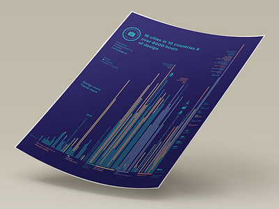
This is not your ordinary infographic resume. I worked on this for two weeks which is much longer than how I usually spend on a resume. Inspired by Malcolm Gladwell's 10000 hour theory and the 4 Edward Tufte data visualization books that I read, I made a visualization of all the hours that I've spent designing since I was a freshman in college until now. One circle is two hours and each column represents a month. This is possibly one of the nerdiest resumes ever since I actually wrote a Python script to generate the graph. The graph resembles a skyline which is appropriate for my self-branding as a travel lover.
View the larger design and the design process at http://mika.ph/resume